Combine wood and other materials: what color goes with wood?
If you want to add coziness and natural materials to your home, you can safely choose wood as a material for furniture or flooring, and maybe as a wall decoration. Whether rustic or modern, rich or minimalist, every lifestyle can be tastefully organized by choosing the right type of wood. In addition: oak, birch, walnut, wenge and many other wood options vary greatly in color and texture. In order for the overall appearance of the room to be harmonious, the combination of wood, other materials and colors is crucial. Some types of wood and colors go especially well together - read more in our article.
Combination of wood with other colors
Before choosing flooring and furniture for your home, you must develop a color concept for the design of your room or apartment. First of all, we are talking about choosing the main color that fills the space. This can be paint for the wall, floor, ceiling. Sometimes the main color of the room is set by the furniture. You can consciously choose a contrasting room design or add a harmonious atmosphere by choosing similar colors. If the color palette is set by the walls, then wooden objects are usually placed in the center of the room.
Combination of different types of wood
Different types of wood differ greatly in color and texture. Therefore, the question “what color is suitable for wood” should be asked within the framework of a specific species. In addition, light from windows or general lighting in the room plays an important role, because, for example, the mood of dark wood is very dependent on the light and surrounding objects. Rocks with large details look good in red or dark designs, while small ripples look better in light colors. There is nothing stopping you from combining different breeds and colors to achieve the best effect.
Ash in interior design
In some varieties, ash wood closely resembles maple. It is characterized by clearly recognizable tongue-shaped grains. The material is very hard and therefore relatively difficult to work with. But it looks great with warm tones, creating the perfect nice monochrome look. Most of the colors, in addition, visually expand the space and have a calming effect.
Mahogany in the interior
You won't confuse this color with anything else. Wood itself is very noticeable, so it doesn’t go well with equally bright colors: yellow, orange, pink. With such “screaming” neighbors, mahogany furniture or flooring will look out of place. It is best to combine it harmoniously with light colors. Delicate, light objects create a beautiful light-dark contrast without destroying the color harmony. When choosing a color, it is always better to consult with professionals; usually an interior design studio will easily select the necessary combinations. In Moscow, we can recommend Studio Interno - contact them for advice on color solutions.
What color suits chestnut wood?
Chestnut wood has a presence with a distinct golden hue. It was rarely used for floors or walls, but laminate with a similar texture is now common. Of course, chestnut will warm up any space and make it look truly inviting. The pleasant wooden tone goes well with dark colors: emerald green, cobalt blue, burgundy. For a quiet and rather neutral atmosphere, beige, cream, gray, white are suitable
What color suits oak?
Oak wood is characterized by a medium tone, which makes it universal. In combination with cool wall colors it is especially attractive. Rustic dark oak, on the other hand, can support strong interior colors in red, orange or purple. You can use yellow or bright blue. Oak and blue-gray combinations are often used in modern apartments.
Walnut or wenge
Dark woods such as walnut or wenge usually pair well with a variety of colors, depending on the effect you want to achieve. From ancient noble to modern - such furniture and wood look great in all interiors. The combination of dark wood and a light brown color such as beige, sand or cream is especially chic and elegant. A complementary color such as red, orange, pistachio green or turquoise will create wonderful accents. A calm atmosphere is easily created by combining walnut or wenge with a light shade of gray, complemented by pastel green or soft mint. A harmonious warm atmosphere is created by a combination of dark wood and shades of yellow and orange.
Maple and birch wood
Lightweight maple and birch objects work especially well when paired with contrasting colors, from red and brown, green and blue to grey. Additional shades will perfectly complement the stylish interior design.
Pine forest or alder in the interior
Pine forest and alder are characterized by medium brightness and color saturation. This is the best way to combine light and cool colors such as blue, gray or white. For the Scandinavian style of furniture, such combinations are used very often. Warm wood tones and cool colors create a pleasant atmosphere. You can choose paints for the walls in blue or light green tones - and everything will be fine.
Beech in apartment design
Beech is available in a variety of colors. Therefore, this type of wood is extremely flexible in use and is equally good in any form. Blue, purple, and mixed colors of blue and green look especially good next to a beech tree.
Cherry and rosewood
Cherry and rosewood are considered noble wood species, which are characterized by an expressive, reddish base tone. They allow for nice strong colors and accents. At the same time, neutral shades such as gray and elements of black or white are also attractive. For an elegant effect, combine cherry or rosewood with beige, cool gray or white shades. If you like strong colors, you can experiment with green-yellows, strong, vibrant reds and berry tones.
Premises map
Brown - the color of chocolate, coffee, cocoa, cinnamon - is a very “delicious” color, which is why it is so often used in cafes, restaurants and other public institutions. In combination with vanilla beige shades, it immerses you in an atmosphere of incredible coziness and warmth, comfort and ease of perception. Interiors in brown tones are very popular, they are neutral, never get boring and you don’t want to leave them for a long time. If brown is used in office interior design, it helps maintain a sense of stability and create a positive image of the company.
Brown color helps create an atmosphere of harmony
and peace. Design studio "Understanding"
Cream is ideal for home cooking, as most people perceive it as warm and delicate. This classic shade promotes a good appetite, especially if it is close to light brown. Cream can also be used in kitchen accessories - from porcelain dishes to small items.
Dark brown wood floors, furniture, paneling and furnishings will add warmth to your living room. It will be a pleasure for family and friends to stay in such a room. She will look noble and elegant. In such a room it is pleasant to sit with your legs crossed in a cozy chair with your favorite book in your hands. If an excess of dark brown tones overwhelms you, then you can use the colors of precious stones - amethyst, garnet or emerald - as complements.
In this living room, brown is presented in all its glory: golden brown,
terracotta, sand, dark chocolate color. Design studio "Understanding"
In a bedroom decorated in brown tones, you will always feel completely safe. Cream has a soft effect, expands space, makes it easier to perceive reality, and gives confidence that everything will be okay. It is perfect for the bedroom. And the golden-ocher shades of the textiles fill it with a feeling of sun and give it a warm, cozy look.
Beige, peach and café au lait look beautiful in bathroom decoration, especially if you complement the design with darker details. Interestingly, depending on the shade, taupe can be the most dramatic of neutral colors. Wine red or gold look great against a taupe background. This combination will be a pleasant surprise for your guests.
In the color scheme of the office, a harmonious combination of warm and cold tones is desirable. Combinations of dark blue and dark brown, tan and beige with small splashes of accessories in bright red or dark burgundy colors are considered successful options. Furniture in reddish brown or dark brown is ideal for a classic-style office. Reddish-pink accessories and details, such as a lampshade or curtains, with a dominant chocolate or dark brown color will make the atmosphere of the office less serious and tense and will help the birth of important and correct decisions.
It is not recommended to use brown color in large quantities in children's interiors. If only the lightest colors, combined with fresh shades of greens, yellows and oranges, as well as various warm shades of wood in furniture.
Brown, due to its naturalness, loves warmth. Therefore, the lighting should generally be chosen as warm: soft fabric lampshades that provide diffused light, a warm fire from the fireplace... What could be more cozy and peaceful. In more laconic style solutions, you can use cold lighting. In this case, brown will look more fresh and invigorating. This option is more suitable for workrooms and various office spaces, although it can also be used at home - it all depends on your preferences.
Contrasting white elements highlight the brown base. Design studio "Understanding"
What colors go with dark wood?
If you want to add coziness and natural materials to your home, you can safely choose wood as a material for furniture or flooring, and maybe as a wall decoration. Whether rustic or modern, rich or minimalist, every lifestyle can be tastefully organized by choosing the right type of wood. In addition: oak, birch, walnut, wenge and many other wood options vary greatly in color and texture. In order for the overall appearance of the room to be harmonious, the combination of wood, other materials and colors is crucial. Some types of wood and colors go especially well together - read more in our article.
Combination of wood with other colors
Before choosing flooring and furniture for your home, you must develop a color concept for the design of your room or apartment. First of all, we are talking about choosing the main color that fills the space. This can be paint for the wall, floor, ceiling. Sometimes the main color of the room is set by the furniture. You can consciously choose a contrasting room design or add a harmonious atmosphere by choosing similar colors. If the color palette is set by the walls, then wooden objects are usually placed in the center of the room.
Combination of different types of wood
Different types of wood differ greatly in color and texture. Therefore, the question “what color is suitable for wood” should be asked within the framework of a specific species. In addition, light from windows or general lighting in the room plays an important role, because, for example, the mood of dark wood is very dependent on the light and surrounding objects. Rocks with large details look good in red or dark designs, while small ripples look better in light colors. There is nothing stopping you from combining different breeds and colors to achieve the best effect.
Color characteristics
When choosing a color, you should decide what task the fence should perform:
- get lost and merge with the landscape;
- be original and unusual;
- isolate the area from the environment.
Color options for the fence can be as follows:
- White color. Visually expands the space, is associated with cleanliness, light and order, and goes well with bright greenery. Cool spectrum color.
- Grey colour. A fairly ordinary color that visually increases the area of the site.
- Brown color. A warm and natural shade that goes well with plants and trees and almost any façade.
An example of brown color in the design of a fence
Golden Oak
The color of golden oak can be considered the closest to the color of natural oak, which has a light straw tint. To obtain a rich golden hue, the wood is varnished or lightly tinted.
Golden tones can be seen in other complex wood treatments. For example, in a rustic oak shade.
Rustic is a special wood treatment aimed at “aging”. Under its influence, the relief of oak wood increases, and the tips of the protruding wave crests are painted in darker shades. In nature, this effect is achieved by prolonged exposure to water and wind. Honey shades give way to caramel and the color of burnt sugar is deeply loved by designers. Although this treatment does not necessarily give a golden hue.
A golden hue can also be seen in sedan oak, which is also not a type of wood, but a processing technology.
In the interior, such shades of oak are combined with warm shades of ocher: straw, yellow ocher, red, light green, brown, dark red brown, gold, silver, dark chocolate color.
Detailed description
Article No. 3769205
4
(38) Read reviews
Lasselsberger Ceramics Western Wood Gray - matte relief floor tile with a realistic pattern of aged parquet.
About the collection
The Western Wood collection features porcelain tiles with a parquet board design. Imitation of aged wood along with a harmonious color palette makes the interior especially impressive. This flooring is suitable for modern and ethnic styles: loft, Scandinavian, country, chalet, etc.
Advantages
- — Lasselsberger porcelain tiles are ideally compatible with heated floors.
- — The tiles are easy to clean, resistant to stains, and easy to clean using household chemicals.
- — Durable, wear-resistant coating can withstand mechanical loads and is suitable for finishing wet rooms.
- — Ceramics is an environmentally friendly, natural material, absolutely safe for health.
- — Tiles measuring 20x60 cm are conveniently laid in a “deck” or “herringbone” pattern for greater resemblance to natural parquet.
- — One package of 6 products is enough to cover 0.84 sq.m.
Application area
Wood-effect tiles are suitable for both home and public interiors. Thanks to the realistic imitation of aged parquet, Western Wood porcelain tiles can be used to finish the floor not only in the bathroom, toilet or kitchen, but also in the hallway, corridor, and living room. The material looks luxurious in a retail space, restaurant, hotel lobby or business center.
Lasselsberger Group is an international holding company specializing in the production of ceramic tiles. Collections for the company's plant in Ufa are created by leading Italian and Spanish designers, taking into account the latest trends, wishes and tastes of Russian customers.
Dark oak
Dark oak could acquire its color in different ways. First of all, these can be oak species that have a natural rich shade. For example, Cognac oak, which grows throughout Europe, including the British Isles.
The second way to obtain dark wood is thermal treatment. In this way, quite dark and beautiful finishing materials are obtained, and it also improves the already excellent qualities of oak.
And the third most remarkable: bog oak - oak that has been in water for centuries.
Currently, they resort to an artificial staining method, due to which oak acquires a wide variety of dark colors.
Color combinations in the interior with dark oak will look good: velvety orange, reddish, rich tomato color, swamp green, royal blue, gold, silver, black.
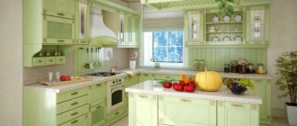
Why we love the texture and color of natural wood in kitchen design
All shades of wood, whether light or dark, are neutral and comfortable for human perception. Even if you are not an ardent supporter of everything eco-friendly and natural, in an effort to create the most cozy and relaxing atmosphere at home, you will most likely resort to natural colors.- Shades of natural wood have an amazing ability to combine with almost all colors in the interior. This is an excellent basis for creating an individual and unique style kitchen of your dreams.
- A good kitchen, like many expensive furniture, is purchased with many years of use in mind. Of course, fashion is changeable, with each season new trends appear and new materials are used.
Read
about fashionable kitchen design in 2020 article
. Therefore, the use of basic and neutral colors such as white, gray, black, beige and shades of natural wood make the kitchen relevant for many years. These colors definitely won't go out of style! And you can always dilute the interior with fashionable and bright interior details, textiles and decor. - Another strong argument in favor of using wooden surfaces in the kitchen is their texture and heterogeneous color texture. Kitchen furniture and finishing materials are subjected to severe tests every day, especially in families where they cook a lot and like to gather around a large family table. In the process of cooking and noisy feasts, water inevitably splashes, oil or vinegar is spilled, something is broken, something is dropped - anything can happen. And if traces of such exposure may remain on the light, smooth surfaces of facades, countertops or floors, then the texture and color of the wood will hide minor scratches, cracks, stains or drops of water.
Black oak
Bog oak that has lain under water for about 1000 years is considered truly valuable. The wood of such a tree becomes black and very dense. The aging process completely changes the properties of the wood, it becomes “iron” and serves for a long time.
With the help of artificial staining, you can also achieve shades of black and smoky colors, which is why black and gray parquet floors are so common, bringing the luxury of the last century and new technologies of the present into the interior.
But not only artificially aged wood can be black. The widespread Wenge oak grows in the tropical jungles of West Africa. Its wood is a dark chocolate color with black veining, making it appear deep black.
When using these wood tones in a renovation or room design, consider combinations like black oak and gray white, sky blue, brown beige, champagne splash, scarlet, yellow, gold, silver and gray.
VIEW COMBINATIONS WITH SIMILAR SHADES (click on color)
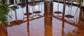
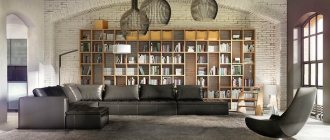
Wood is an absolute trend in recent years! Wood in the interior looks stylish and cozy; it makes us closer to nature among the stone jungle.
Let's figure out how best to combine wood in the interior of an apartment or house.
Thanks to the variety of shades and types of wood in the interior, you can create a unique and inimitable design. Using wood will suit many popular styles.
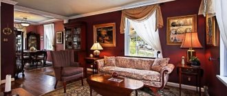
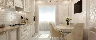
Classic interior with wood
To emphasize the sophistication and elegance of the interior, we recommend using dark-colored parquet, baseboards, cornices, moldings and columns with an open wood texture, that is, without covering them with paint. Wood will fit perfectly into a classic interior if used as wall panels.
American classic interior
It also implies the frequent use of wood in the interior, only white (bleached oak or painted), with many wooden details in the interior - columns, beams, balusters, and, of course, stairs.
Wood in a Scandinavian interior
It will highlight the variety of textures and textures; correctly selected species can make a room warmer or colder. Decorating the walls with wood and highlighting the beams against the background of a white ceiling are also suitable here. Here you can use the lining and paint it in the desired color (white, black, gray, blue).
Country and chalet
Interior decoration with wood is mandatory for country and chalet styles. Country is an American rustic style, and a chalet is more like a “hunting lodge in the snow-capped mountains. Country colors are characterized by grey, white and pistachio shades, as well as gradations of brown.
The interior of the chalet is darker in color, the furniture is more massive and confident. Here we leave the surface of the rock as natural as possible; for example, roughly processed logs are suitable for decorating the ceiling.
Rounded timber can also be used for decorating furniture and cladding an artificial fireplace. A house made of rounded timber practically does not require finishing of the walls inside; you feel protected in it.
Tree in Provence
Another interior that is unthinkable without natural materials is Provence. As in the Scandinavian and country style, we select light wood species to emphasize the lightness of the space, complement it with an abundance of fabrics and carved wooden vintage furniture in different shades (pistachio, peach, lavender).
What kind of tree can it be?
Each type of wood has advantages and disadvantages and is good for different situations.
Pine
One of the cheapest and most popular breeds. At the same time soft and durable. It is used for finishing stairs, making furniture and decor. The sunny golden shade of pine will fit into a modern interior, for example, Scandinavian and Provence.
Suitable for parquet, stairs, doors. The breed is surprisingly strong and durable, so it is suitable for surfaces. who are constantly under stress. The color of oak varies - from bleached to stained (almost black). Noble oak is ideal for a classic interior.
Also classified as a hard noble variety, it becomes darker over time. Color – dark brown, may give off red. Suitable for classic and rustic interiors, it brings elegance to the environment.
Light pinkish beech
Beech is able to enliven dark rooms. When steamed, it bends easily, and when dried, it retains its given shape. The famous bent Viennese furniture is made from beech. Its color varies from pinkish-yellow to reddish-brown. Beech wood is very durable and hard, sands well, and when treated with varnish it practically does not lose color.
How is corrugated sheeting better than natural wood?
Wood is a traditional building material with a beautiful texture and a pleasant tactile feel. For flooring or interior decoration of living rooms, wood is the best option. The same cannot be said about using wooden boards outdoors, for example, for cladding a building or constructing fences - in this case, all the disadvantages of this material appear: rotting, insect damage, swelling from moisture, and others. A corrugated sheet coated with a wood look does not have these disadvantages and at the same time visually differs little from the natural material.
Unlike wooden boards, corrugated boards:
- Moisture resistant
. Corrugated board under the timber does not absorb moisture, so it will never swell or crack when drying, as often happens with natural timber. - Not affected by fungus, mold, lichens, insects and unsuitable for rodents
. Corrugated metal sheets do not need to be regularly treated with protective compounds to avoid damage. - Fireproof
. The wood must be kept for a long time in special baths so that it does not catch fire from an accidental spark. But few people in Russia do such impregnation, usually limiting themselves to just applying a coating on the outside. A metal profile is, in principle, a non-flammable material. - Weighs less
. Corrugated façade wall sheeting made from C8 grade wood with a thickness of 0.5 mm weighs only 4.29 kg per 1 m², and wooden cladding of the same area made of relatively light pine or spruce with a board thickness of 20 mm will already weigh about 15 kg. - Easier to install
. Although wood is an easy material to process and fasten, corrugated sheeting is even faster and easier to install due to the larger sheet area and lightness. - Resistant to chemical attack
. Corrugated sheeting can be used for external work in ports, near salt water bodies and near chemical industry plants. - Easy to clean.
Unlike “loose” wooden boards and timber, wood-look corrugated wall sheeting is a smooth material, the dirt from which can be washed off with a regular damp cloth. - Does not require annual maintenance.
Wood-look corrugated sheets do not need to be treated and painted every year to maintain their appearance.
In addition, corrugated sheeting is much cheaper than natural material. If you compare a wooden board for exterior finishing (planken) and a corrugated sheet for wood, the price of a metal profile will be at least one and a half times lower. And this does not take into account the cost of protective treatment of the board after installation.
For example
Let’s take standard wood-look corrugated wall sheeting - the price for a sheet of grade C8 with a standard length of 6 m and a thickness of 0.5 mm is in the range of 3,500 to 3,700 rubles if you buy a small batch. This is approximately 540 rubles per 1 m²
.
Larch planks cost 800–1,500 rubles per 1 m²,
depending on the type, and the cost of oak starts
from 4,000 rubles per 1 m²
. The price of pine plank is comparable to the cost of corrugated sheets, but its service life when installed outdoors is not 25+, but only 15 years.
At the same time, the metal profile under the timber, unlike planken, will retain its original appearance for years. It will not stain, darken, dry out or crack. Therefore, it is well suited for external work.
Top ↑
Mahogany color and its combination
lookcolor.ru » Red » Mahogany color and its combination
Mahogany is the color of elite wood varieties. The combination with it is close to the combination of burgundy. Its meaning, application in clothing and interior design.
The name of the color speaks for itself - it is the color of wood, but not just one species, but a whole set. The red hue is the unifying factor. The brightest color is the most valuable.
The fashion for products made of red wood began in England at the beginning of the 17th century, and at the end of the 18th century its popularity gained full strength. Interiors in the neo-empire style were an example to follow. The import of bright varieties of trees has reached an unprecedented scale. Since then, the idea of woody red has always been associated with a feeling of luxury and aristocracy.
Mahogany color matches
with dark orange (2), creating a soft, velvety combination. It brings out the warm notes of mahogany. You can easily combine tones by changing the size of the “spot”.
with green tea color (3) – contrast of complementary colors, green tea is refreshing, but the combination is harmonious only if green is a modest addition or it is diluted with a neutral, for example, light beige.
You can complement the range with warm light and medium pink, as well as cinnabar.
Mahogany color combination table
The mahogany color combines naturally and gracefully. He pairs the same complex tones as himself. Prefers dark or pastel colors, so the contrast of the combination looks more attractive. The shade can participate in thermal contrast, although it prefers to create warm colors. Consider the tables of combinations of this color, perhaps you will choose something for yourself.
Mahogany and pink
- this is a combination of similar shades, it is harmonious and unobtrusive, built primarily on light contrast. The palette is composed of white-lilac, lilac, sakura, fuchsia, dark purple.
Mahogany and red
- a combination of colors of the same range with not a large difference in lightness, but different undertones, which gives it a “zest”. It involves dark red, alizorine, terracotta, coral, and dark burgundy.
Mahogany and orange
- orange, like pink, is related to it, and if the first one pulls the shade towards red, then orange emphasizes its note in it. Consider pairs with light peach, pumpkin, sea buckthorn, red, and copper.
Mahogany and yellow
- a contrasting pair, where the latter is much lighter than the first. Since yellow is a warm tone, the whole combination raises the temperature. Combine gray-yellow, champagne, wheat, dark yellow, golden oak with the main tone.
Mahogany and warm green
- calm, colorful, natural colors. Green, as a complementary color to red, enhances its properties, and the soft shades we selected, such as avocado, fainting frog, swamp green, olive, pine, do not irritate, but are harmonious.
Mahogany and cool green
enter into thermal contrast. Due to the similarity with the complementary color, the pair looks expressive and effective. The palette includes light gray-green, wormwood, gray-green, emerald, and malachite.
Mahogany and blue, light blue
- this is the contrast of cold and warm. It can also be joined by the expressiveness of light and dark if the pair includes blue. The gamma is made up of blue sky, gray-blue, black sea, blueberry, thunderstorm.
Mahogany and purple
- a medium-expressive pair, since the shades are similar and are on the same line of lightness, but even purple adds a certain mystery to the combination. consider pairs involving lilac-lilac, gray-lilac, gray-violet, charoite, violet-black.
Mahogany and brown
- a successful, discreet, but expensive and harmonious combination. Brown makes the base color rich and emphasizes its complex nature. Combinations with the color cocoa with milk, cappuccino, dark chocolate, dark chocolate, and black chocolate will be beneficial.
Mahogany and neutral color
, these include white, beige, gray shades, which ideally set off the deep dark red color. For example, a palette of ivory, papyrus, gray-lilac, anthracite, lead.
Popular colors of corrugated sheets
Green corrugated sheeting is available in several shades. Of these, the most popular remains the “ green moss”
"- RAL 6005. The color fits perfectly into the green landscape, combined with the shade of the earth, so it is often used in country fences made of corrugated sheets, as well as for roofing. “Green moss” is a good option for a house lined with brick/brick panels. The dark green roof blends organically with gray, beige and pale yellow facades.
Another popular shade is “ lawn grass”
"(RAL 6002) – juicy and bright. It is suitable for you if you need to create a “cheerful” fence or a noticeable facade.
White corrugated sheeting , as well as beige and gray colored sheeting, are not very suitable for roofing. Dust and dirt are too visible against a light background. In addition, a white or beige roof is nonsense from a design point of view. The gray one (corrugated sheet RAL 7004) has a right to exist.
Light colors have found their application in the decoration of facades and balcony parapets. Thus, corrugated sheeting RAL 9003 - signal white - is the most popular in facade decoration, since it can be combined with any companion color with the exception of dark shades. Cream or beige ivory corrugated sheeting (RAL 1014, 1015) is a gentle, warm and more practical shade than white. With its help you can give the facade comfort. The gray facade in the correct color frame looks strict and noble.
Gray and beige corrugated sheets are often used for fences. Such fences look light and perfectly expand the space, but they will have to be washed quite often.
Brown corrugated sheeting confidently fits into the territory of suburban dacha plots. This is an ideal corrugated sheet for fences and roofing. The most popular color of corrugated board is RAL 8017 “chocolate”. What is its advantage? A rich and noble shade on which dirt is almost invisible. Chocolate corrugated sheets fit perfectly into the natural landscape.
Roofs made of brown corrugated sheets look especially cozy in combination with a delicate light facade. A brick or wooden facade is also “friendly” with it, if, of course, it is not too dark. In a word, this is a color that is very easy to choose the right combination for.
For those who love bright solutions, it is impossible to go past corrugated sheets in red shades . Here they most often mean corrugated sheeting RAL 3005 “red wine” or “cherry”. The noble ruby color will make your building stand out among many others. The classic combination is a wine-red roof and a light yellow facade.
Also, the facade can be made beige, light gray, soft pink. Red roofing is the best option for a house made of natural wood. This color is not suitable except for a red brick house, since similar shades will not create the necessary contrast. Corrugated sheeting 3005 also makes excellent fences. They are non-staining, not too dark, and green vegetation against their background looks even juicier and brighter.
Mahogany color in clothes
If you have red hair, or have a red tint, and your face has a warm yellowish tone (Autumn appearance type), then this is your color scheme.
The color of mahogany is slimming and well masks figure flaws (naturally, with a successful cut), making you bright and majestic. It will look good in woolen items, silk blouses and cotton items. Evening dresses will look great.
Dark orange complements the mahogany tone: use a suede cropped jacket with a dress, suede shoes or a handbag. You can choose gloves, shoes and a handbag for a mahogany-colored coat.
The green tea shade is refreshing and calming next to the base tone. Use it in “smooth” elements: silk, stones in jewelry.
In addition, mahogany is suitable for representatives of the “summer” color type - as a complex, dark, multifaceted tone.
You can combine mahogany with many shades in clothes. Classic pairs are with black, white, gray (silver), beige, brown and strict dark blue. Combinations with yellow, red, pink, and green leave vivid impressions. Let's see how these combinations look in your wardrobe.
Color Options
When choosing a color scheme for a fence, you need to determine what function the fence performs first:
- It cannot blend into the surrounding landscape, otherwise it will get lost and become inconspicuous.
- It must be original and non-standard.
- The fence should highlight and highlight the area, making it special against the background of the environment.
Optimal color solutions for fencing:
- White is a color that visually enlarges space, is subconsciously associated with cleanliness, provides airiness, and belongs to the cold spectrum of colors.
- Gray is an everyday color that visually increases the size of the area.
- Brown is a universal and natural shade of warm colors that goes well with the greenery on the site and any color of the facade.
- Green color is the most popular option, emphasizing the building and merging with the landscape of the site. An ideal solution for people engaged in mental activity, as green is pleasant to the eyes and calms the nervous system.
- Yellow color - associated with solar warmth and light, goes well with a white or brown facade.
- Blue is a symbol of clear sky or water. Sets off the green background of the site, best combined with a gray or white facade.
- The red fence is a rich external option that can be combined with various facades. It is best combined with a façade faced with brick or natural stone.