Light green and all its undertones have found wide application in various areas of human activity. This includes drawing and use in interiors, clothing, etc. etc.
Light green goes well with a number of different colors and tones that at first glance seem incompatible.
The only downside is that it is not available in finished form (that is, in any case, it must be created independently by mixing different undertones).
At the same time, such work is not difficult; even a beginner can do it.
It is enough to know which colors to combine and in what proportions.
Basics of color science
Color science means the science of color, which reveals its nature, features and specificity of color as a whole.
You also need to become familiar with color schemes in order to mix correctly and get shades that can then be used in practice.
It is also worth knowing that the basis of all combinations that can be obtained are colors and shades from color wheels.
All existing ones are divided into chromatic (color) and achromatic (shades of gray, black and white).
You can also combine yellow, blue and red in different proportions, then add a small amount of black or white paint to the mixture (depending on whether you want to lighten or darken the color) and get a whole range of different tones.
As for yourself, you can also make it yourself, just by combining the required colors in appropriate proportions. What paints (watercolor, acrylic or gouache) will be used does not matter. If necessary, you can add black or white dye to the color to darken or, conversely, lighten it.
What colors goes with light green in clothes?
The light green tone of clothing can be used to create laconic and unusual combinations with a wide variety of colors. It is noteworthy that ladies with any color type of appearance can afford light green, provided, of course, that they take into account individual characteristics and body type when choosing a style. Let's talk in more detail about successful combinations of light green color with other tones.
- Black and light green . Of course, this is a classic that simply cannot be ignored. In the center of the look there can be bright light green leggings, complemented by a black tunic or an elongated cotton blouse. The legs will be decorated with black or light green shoes. A small light green clutch or black handbag will complete the ensemble. If you wish, you can find a headdress or scarf that will decorate your neck.
- Light green and denim. A top in a juicy light green shade can be complemented with fashionable blue jeans. It is permissible to include bright light green shoes or openwork boots made of leather, suede or knitted into the ensemble. You are free to choose accessories and decorations. If you want to create a bright image, you can use yellow jewelry and a handbag. If you want to maintain the neutrality of such a bright image, a black handbag and silver jewelry are enough.
- Lime and yellow. A bright and advantageous combination that allows you to stand out from the crowd. You can use a light green bustier top, yellow short shorts, low light green sandals and a yellow handbag.
- Light green and white. A balanced and laconic combination. You can add a hint of yellow to such a union. This could be a white top, light green shorts and yellow sandals. The decoration can be a chiffon scarf around the waist or neck in yellow or light green colors.
- Light green and purple, light green and lilac. To make sure the look is harmonious, wear a white top, light green shorts-skirt with a satin ribbon at the waist, a white top, a purple jacket and handbag, light green sandals or shoes with heels or low heels.
- Light green and pink . A very advantageous combination that every young fashionista can try for herself. To make sure of this, wear straight, skinny or flared trousers in a pale green color, a soft pink top, a blouse or a thin knitted sweater, black sandals and a strap. You can put a pinkish-yellow scarf around your neck and decorate your hands with coral bracelets.
- Lime and blue. Various shades of blue harmonize perfectly with light green sketches. These could be light green trousers of a dark green color, tapered to the bottom, paired with a loose coat of azure color, above the knee. The pair will be complemented by a pink or coral suede shoulder bag and black ankle boots or ankle boots. You can also make a set of trousers in a rich light green shade, beige heeled shoes, a blue top or blouse and a black jacket. The ensemble will be completed with a black square patent leather handbag.
- Light green and beige . The ensemble can be based on light green trousers made of leather, denim or other material. You can add a silk top and jacket in a pinkish-beige shade and beige ballet shoes. Gold and black jewelry will add interest to your look.
- Light green and blue. Bright yellow-light green harmonizes perfectly with blue. Pants in electric blue, a yellow-lime top with a peplum, blue jewelry and a handbag and light green sandals will look very advantageous.
- Light green and green shades . The transition from one tone to another within the same color will look good. These could be light green trousers, a light green top, green sandals, etc.
- Light green and brown . Another harmonious option, which may involve a brown suit in the form of trousers and a jacket, light green shoes and a top.
- Light green and orange . Stylists claim that such a union looks very profitable and attractive. This could be a light green summer dress, an orange handbag and sandals - a very trendy set for the beach!
Mixing colors
There are several options for combining dyes in order to obtain a light green undertone and its shades.
What type of paint will be used is not so important.
To receive the composition, you must have with you
- Palette (or flat bowl).
- Several different brushes.
- Container with water.
- Napkins or cloths (to clean devices).
- The dye or dyes themselves.
The easiest and fastest way to get a light green color is to add white paint in the required proportions to the ready-made light green dye.
A green undertone, in turn, can be obtained by mixing blue and bright yellow paint in half.
Using white, you can create light green from any type of light green paint. But, you need to take into account that such a color will be a little faded, without a hint of yellow, which gives the color brightness and richness. But to correct the situation, just add a small amount of yellow paint to the color and mix everything until smooth.
Successful combination of colors in the interior
First you need to understand an important rule that applies in any room:
decide on the main color, and then start selecting the rest (in accordance with the characteristics of the main one).
This will help to avoid the global mistake when individual interior elements look good, but do not fit together in one room.
Another important condition is consistency with style. In modern and high-tech, certain colors are preferred; for country, classic and Provence, others are preferred.
Kitchen
The first option that comes to mind for almost everyone is white and its shades. The color is universal, as it easily fits into many styles and goes well with most other colors. A white kitchen symbolizes cleanliness and order. In addition, the calm color of the environment will not irritate the eyes. This is important for housewives who spend a lot of time in the kitchen. In combination with a small number of bright contrasting details, such a kitchen will always look elegant.
The optimal solution is to match the white kitchen with interior details in red, black, purple or brown.
Read more about color combinations in the kitchen interior.
Red color is good for a spacious kitchen. Its properties in such a room include increasing appetite. However, it is worth considering that the bright atmosphere of the kitchen can quickly become boring. To avoid this problem, it is better to choose deep, rich tones of red.
The most successful color in the kitchen will be combined with metal and glass. If we talk about specific colors that go with red in the kitchen, these are white, black, metallic.
Orange. Pleasant, cheerful, sunny. An excellent choice if you want your kitchen to always be bright but cozy.
There are many colors for “cooperation”: green (and its shades), brown, white.
Blue as the main color is good for a hot room. If the kitchen window(s) are facing north, you should abandon this color scheme; the room will seem uncomfortable and cold even at high temperatures.
Blue goes well with coral, yellow, orange, and white colors.
Green. The first strong association with this color is living nature. Regarding the choice of the main color for the kitchen, we can say that this is an excellent option. After all, it has long been proven that the green color of soft shades promotes good digestion.
Green color in the kitchen will look good in combination with white, yellow, and blue.
Yellow color in the kitchen. It is worth using it as the main one when the lighting is well thought out. Otherwise, the kitchen will look dull and uninteresting.
Good combinations for yellow in the kitchen are white, blue, and silver.
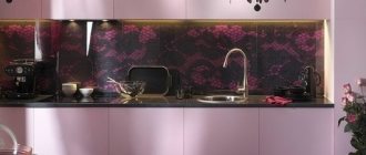
Purple is the main color in the kitchen. This is quite a bold decision. It is original and always unusual in the interior. A purple kitchen will always look fresh and fashionable.
This color goes well with olive or ocher tones.
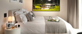
Bedroom
The choice of bedroom colors should be taken responsibly. After all, this is a place to rest, relax, and sleep. For many modern people, the bedroom is the only refuge for peace after a hard day. It is worth considering this when planning the color scheme of the room.
See more photos of the bedroom interior.
One of the most successful colors for a bedroom is beige. It relieves eye fatigue, improves mood, and allows you to relax. As a main color it is very convenient as it can easily be combined with many other colors.
The most winning combinations are beige+white, beige+black, beige+brown, beige+green.
A purple bedroom is most often a woman’s choice. For men, this color often evokes an analogy with lilac and pink. The color is independent and bold for the interior.
To prevent the bedroom from seeming dark or dull, purple should be diluted with white and light brown.
Lilac color is close to violet. However, it is easier to understand and easier to select partner colors.
The lilac color in the bedroom looks most successful in combination with beige and white.
Green color in the bedroom is a symbol of the cheerfulness and love of life of its owner. Good for those who have to get up early for work. Fresh and bright greenery will encourage you to wake up quickly and make your morning energetic. There are many combinations with green, it depends on the shade of green itself.
If it is a bright pure tone, then you should choose white, yellow, light brown, beige. Dark brown, blue, and deep beige are better suited to deep green.
A blue bedroom is an option for romantics and dreamers. After all, it is he who reminds of the sea. The color used as the main color in the bedroom has good properties. Blue helps you quickly relax, drive away heavy thoughts, and relieve stress.
Blue color in the bedroom goes well with white, light green, red, light brown.
Brown. For the bedroom, this is one of the classic colors.
It goes well with green, white, beige, black.
Black color for the bedroom is an unusual option. If you are not afraid that an interior with a predominant black color will be “overpowering,” feel free to choose it. White and shades of brown will help to dilute the black color in the bedroom.
An option for bold natures is a combination of black with pink, bright lilac, and purple flowers.
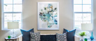
Living room
In a sense, the living room is the calling card of the home. This room has several functions:
- front room for receiving guests
- family gathering place in the evenings
- home cinema
The design of this room should be given special attention. And the choice of colors for decoration plays a dominant role in this case!
A beige living room is a win-win choice. Playing with color contrast would be inappropriate in such an interior; it is better to choose shades that are similar in color palette.
Beige color will look great with coffee, brown, and gold.
Gray as the main color in living room interior design is a rather rare option. The most important thing when choosing it is the shades. Light pearly tones of gray will give the room an atmosphere of strict sophistication, but dark ones threaten to make it boring and dull.
Gray goes well with orange, pink, black, and some shades of green.
Green. It can be classified as neutral, and therefore a good option for the main color in the living room. The green color of deep noble shades will make the interior refined and even “rich”.
Good combinations for this color are brown, white, yellow.
A living room in lilac color is always fresh and elegant.
Pearl, beige, brown, sand will go well with this color.
Purple color for the living room is a completely acceptable option. A dark tone of this color will give the room solemnity, and a light tone will add lightness.
In the living room, purple is best combined with white, red, pink, and orange.
The main color of the interior is red. If you choose it, be careful. As the first color of the interior, it can “crush” and look intrusive. In moderation, red will make the living room stylish and very fashionable.
Adding to red is brown, beige, white, gold, black, metal color.
Blue color in living room design is usually chosen by calm, balanced people. This color in the right non-flashy shade can serve as the background of a room for a long time, because it is easy to perceive and unobtrusive.
Blue goes well with white, pearl, red, and beige colors.
Children's
The conversation about flowers in a children's room is special. After all, it is necessary to take into account many points at once. The child's bedroom should be positive, bright, and light. At the same time, it is better to avoid overly flashy, intrusive colors.
White color and its shades. When using it as a background for a nursery, you should not overdo it. Otherwise, the room will look not only bright and spacious, but also boring.
If you decide to choose white for your child’s bedroom, use it in combination with pink, light green, yellow, and blue.
Yellow. Bright, positive, joyful. Like no other, it is most suitable for a children's room. If yellow is chosen as the main color for the children’s bedroom, and the room itself is zoned, then you can “play” with shades (decorate the sleeping area in muted and calm colors, and make the play area rich yellow).
This color goes well with white, green, and blue.
Orange. The color of good mood and optimism. Perfect as a main piece in both a boy's and a girl's room.
Goes well with lilac, white, blue, light blue.
Red. It should be used with caution as a background color in a nursery. He is good for his active energy, but may be too intrusive for a child. If you still want to use it in the interior, then limit yourself to one wall or several interior parts.
Red color in a children's bedroom goes well with yellow, blue, and white.
Green room. If you choose the right shade of green, the room will be your child’s favorite place. After all, he is soft in perception, and at the same time positive in energy.
Successful combinations in a nursery are green and yellow, green and white.
Blue and its shades in the children's room. It is most often used for boys. Without additional colors it will look boring and dull, so it needs to be supplemented.
White, orange, yellow, light brown are best suited for this.
Shades of green and their creation
The green undertone has many shades (at least 15), which are presented in both light and dark, and in bright and pale variations, which significantly expands the scope of their use.
As for the artistic field, green has no less than 110 shades, which artists use to paint still lifes and other paintings.
In “winter” paintings, cooler shades of green are often used (for this you need to combine blue and green colors).
While in summer landscapes light green color is more often used in combination with a yellow tone.
Pastel light green
Pale tones, regardless of color, are “always in price”, because they look refined and noble.
Such tones have a calming effect on both the eyes and the nervous system and are often used to paint surfaces in clinics and childcare centers.
This color can also be used to create cool bedrooms and children's rooms.
In order to get a pale light green color, you just need to add white dye to green (the more white you use, the paler the undertone you can get).
Olive
Olive color is often needed for interior decoration, in order to give an atmosphere of sophistication, tranquility, and, at the same time, unobtrusive richness.
It is also possible to make this color yourself. For example, you can add a small amount of yellow dye to green and mix the color with brown (to tone it down a little).
If you do everything correctly, you can get an interesting dark light green color.
Bottle shade
This color is somewhat similar to a rich, but at the same time deep emerald color.
In order to make it, you must first mix blue and yellow until a uniform light green color is achieved. Next, add a small amount of black dye to it (but you need to use it carefully and in small portions so as not to spoil the undertone).
If you need to get blue, then you need to add blue paint to the mixture portionwise.
Shade of pine needles
In order to create a coniferous tone, you only need to lighten the green by adding a little yellow paint to it, followed by a small amount of black.
If the color is made for the purpose of using it when painting a picture, and you need to “sprinkle it with snow” a little, you just need to add a little white to it and get what you need.
Shade of light green fern
It is made by combining light green with a small amount of black and adding a drop of white.
After the color is mixed until uniform, it will acquire an interesting light-dark shade.
This color is often used to paint the exterior surfaces of residential buildings and other types of premises.
Shade of forest green
It is a classic “fresh” light green.
To add richness and brightness, you need to add a little yellow paint to the dye.
If, on the contrary, you need to darken it, you should add black dye to it (the main thing is to use it in portions so as not to spoil the color).
Light green
The easiest way to get a light green shade is to add white and yellow dye to the green color in the required proportions. But this method is not the only one that will help you get light green.
An identical version of light green can be obtained by combining yellow (which will be the main one), a small amount of dark blue or light blue paired with black.
Note: a rather interesting light green shade can be obtained by combining turquoise and yellow in equal proportions. In order for the undertone to turn out bright and juicy, it is necessary that turquoise predominates.
If we talk about light green when decorating interiors, then in most cases it is used only as accents or decorative elements (textiles).
It is not recommended to use light green as a base or background color (after all, it will put pressure on the eyes and nervous system).
Swamp shade
In order to get it, you need to mix light green with brown and a small amount of red.
This tone is somewhat similar to khaki, but it contains more greenery.
If we talk about using it in interior design, it is better to either abandon it altogether or use it as accents. Otherwise, it will depress the atmosphere and mood of the residents.
The influence of blue on the interior
Blue is one of the main ones. It is part of many other compositional or composite tones - green, lilac, brown and all their many shades owe their existence to the color blue.
- It is traditionally associated with masculine energy. Cool, concentrated, focused, blue is ideal for the design of cubicles and offices, boardrooms and meetings, as well as for the majestic design of exhibition and museum halls. Blue interiors are a very characteristic feature of hotels in hot resorts, as this color has a cooling effect, especially in combination with white and its shades.
- The creative searches of interior designers have led to the fact that blue is increasingly found in residential interiors. It is most often used in living rooms, hallways and other common rooms. Its softened shades decorate bedrooms and children's rooms. Recently, it has increasingly occupied the space of kitchens and dining rooms.
- Blue has a suppressive effect on the nervous system, so it can be used as a calming color that promotes relaxation after work, helps relieve stress and slow down the modern rhythm of life a little. Excessive passion for blue can lead to bad mood, lethargy and apathy, and decreased appetite.
- A blue interior helps concentrate on a specific activity, thought, or problem, so a blue work area for a schoolchild is a very common occurrence, while soft blue tones are more often used to decorate children’s rooms. Unlike blue, blue relaxes and diffuses attention, which promotes calm and rest.
Rules for choosing colors for floors, walls, furniture and ceilings
So, we figured out which color goes with which. Next, we will dwell on the objects that are present in each room, and we will understand the principles of using certain shades.
Floor
There are several unspoken rules that should be considered when choosing a color scheme for the floor.
Light floor:
- Increases space.
- It is a reflective fabric.
- Can be used with a light shade of walls.
- Suitable for bedroom, bathroom, toilet, living room
Dark floor:
- Combines with light walls, ceilings, and dark ones. But it should be at least 1 tone darker.
- Suitable for any room.
- Bright accents look good against its background, provided there is good lighting.
- Doesn't go well with a dark door.
Walls
The walls can be made in absolutely any color. Depending on the purpose of the room used, it can be active, passive or neutral.
Active colors are an accent. They are combined either with the opposite bright color, or with a less bright, calm color.
A popular solution is walls in pastel colors. They play the role of background to the main view of the room. In this case, you can use any floor, furniture, ceiling. Since this is a universal option.
Ceiling
The ceiling is most often chosen in white or light shades. Since it is a universal color and can be combined with any furniture, ceiling, floor. Can be matte or glossy. If you want to add contrasts, it is better to add a rich color to the walls or interior items. Can be used in any room.
If the choice fell on a dark ceiling, then it is worth considering several nuances:
- A black ceiling can only be done in a large space with high ceilings. Minimum height 3 meters.
- Combines only with white and light furniture and milky colors of walls, floors, furniture
- Suitable for minimalist style
- Creates an expensive effect in a room with panoramic windows
Furniture
When choosing the color of furniture, remember 2 basic principles:
- It should be darker than the walls
- Lighter than the floor
Then you can rely on your taste and make the combination of all interior items ideal. See a photo selection of various combinations and get inspired.