Blue
The Pantone Color Institute has appointed Classic blue as the main shade of 2020 - a deep, expressive blue.
This color is suitable not only for the bedroom, but also for the home office. For example, bright, juicy blue has a beneficial effect on the nervous system and reduces aggression. This is a great tone for a bedroom or living room, especially if you have a stressful job. By the way, dark shades of blue are considered especially popular by the American paint brand Sherwin-Williams and the British Farrow & Ball.
The soft blue color will help to visually enlarge the room, “cool” the room if it is on the sunny side, and even reduce your appetite. So this shade would be an excellent choice for the kitchen or dining room.
Cool turquoise will look harmonious in an office area or creative workshop. It brings coolness, peace and helps to inspire.
Without leaving home: 6 services that will help improve your daily life during quarantine Read
Wow effect
If you want a spectacular spectacle, choose a bright or dark color.
This technique will work well in a small room. A particularly interesting emotional effect can be achieved if it is adjacent to a spacious and bright room - as if you are looking into a strange box or a secret room.
To enhance the extravagant effect, you can abandon contrasting infusions of color. The floor, walls and ceiling in a single shade will blur the visual boundaries of the space.
The following are ideal for the role of a “box”: a study, a dressing room, a kitchen area, a bathroom and a toilet. Using a bright or dark monochrome in the living room is a controversial idea for a residential interior; it will certainly look impressive, but can quickly become boring.
Neutral light colors, as well as relaxing muted green and blue tones, are well suited for a mono bedroom interior. Bright colors are not recommended.
Green
A favorite among designers, paint manufacturers and color researchers is muted blue-green. These tones are suitable for eco-style in the interior; they help you relax after work and feel peace while reading a book or watching a TV series. Bright decor matches green colors in the interior: for example, a coffee table, ottoman, pillows in scarlet or pink shades.
Mathematics
Don't be confused by the prefix "mono". When we talk about a monochrome interior, we mean a color palette of several related shades, and not a single color that completely absorbs the space. Such an interior can also include other auxiliary shades: neutral or contrasting. The main thing is that one of the colors dominates the space. For the rest, the correct dosage is needed.
Apartment interior design: where to start?
Where to start your own apartment interior design
Let's turn to the classic color formula “60-30-10” (or “60-30-30”), which allows you to organically combine different shades in the interior. 60% of the visible space is occupied by the main color, 30% by an additional assistant shade, and another 10% (or 30%) receives a contrasting accent color, usually bright.
In the case of a monochrome interior, the assistant shades are close relatives of the main color, and the place of the accent color is usually taken by white, black or a neutral natural shade. It will not be possible to use exactly three colors in a space; some auxiliary tones will still appear in furniture, textiles, and decor. In a monochrome design, it is recommended to use no more than five shades.
Bright spaces where pastel shades dominate should be diluted with whitewash. If you want more clarity and dynamics, add black contrasts.
In order not to go beyond a mono color scheme, you need to pay attention to detail. The spines of books can be hidden in identical covers, household little things for which there was no place behind the facades of the storage system can be placed in plain decorative baskets or boxes.
Grey
For quite a long time, gray was associated with boring office spaces, but modern designers have found its strength: this shade helps to dilute bright colors and reveals muted ones. Decorating a bedroom, living room, and kitchen in neutral gray tones brings harmony to the interior, creates coziness, and with the help of color and well-placed light accents it will turn your apartment into a stylish and comfortable interior for living.
Incorporating turquoise into the interior: recommendations and examples
The versatility of shades of turquoise allows you to decorate any room with it - from the kitchen to the bathroom. Depending on the type of room, the rules for using turquoise in decoration may vary. Typically, designers are guided by the following motto: “Turquoise loves harmony,” and they advise “spotting” beautiful color combinations from nature itself.
Living room
The central room in the house may well be decorated in rich shades of turquoise - this will give it a “royal” look
It is only important to choose the right companion colors so that the overall appearance is harmonious. White, blue tones, and natural wood colors are good for the living room.
Turquoise combines well with brickwork, cork, and light marble.
If the walls are covered with wallpaper, it is better if they have a large ornament. A good option would be light gray or beige walls with a turquoise and yellow pattern. The ensemble will be complemented by turquoise curtains, a blanket and pillows for the sofa. The living room also looks interesting, in which one wall is turquoise and the rest are light or yellow, green
You can add a couple of brown accents, it is only important that their amount is moderate (up to 10-15%)
Bedroom
You can make your bedroom feel like a beach resort “branch” by adding a few turquoise accents or using light aqua wallpaper. The wall covering can be plain or with an unobtrusive ornament. The pattern can be gray-green, yellow, light orange, dark blue - as desired.
A good option is to use snow-white curtains, which will enliven the overall turquoise picture and remind you of sea foam. Lightweight materials are best suited for fabrics: silk, linen, cotton. White picture frames, panels, light furniture, and figurines look great against the turquoise background of the walls.
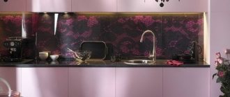
Kitchen
In the kitchen it is permissible to use bright, even flashy shades
It is important that there is enough light here, then the dark turquoise color will not cause a visual reduction in the room. Using this shade you can decorate a kitchen apron, furniture, curtains, blinds, appliances, dining area (of course, not all at once)
It is advisable to make the ceiling and walls light; only a soft turquoise tone is allowed. For finishing it is worth using wallpaper or textured plaster. For variety, shades of brown, yellow or green are added to the interior.
Children's
Turquoise is a universal color; it is suitable for girls and boys. The little princess will love the combination with lilac, the young gentleman will love the combination with green. A duet with one of these colors is suitable for any room:
- cream;
- white;
- creamy;
- beige;
- caramel;
- champagne color.
It is better not to use a dark palette of turquoise, but to stick to soft, delicate shades. Blue-green tones in the interior will help relieve stress and calm the child.
Bathroom
The sea in the bathroom is a great idea. Since it is rarely spacious here, you should not use too dark tones of turquoise. The ideal option is to choose light, azure shades that harmonize with the white background. The tiles can be gray, beige, light brown, while the color of turquoise is given to textiles, mirror framing, bath curtains, and laundry baskets.
Hallway/corridor
This room creates the first impression of a house or apartment, so more attention needs to be paid to its design. An excellent solution for the corridor would be to use cheerful turquoise. If the hallway is small, use light shades of aqua in combination with white or beige details.
Beige
Without beige shades it is impossible to imagine interior styles such as country, high-tech, Scandinavian, modern, Russian retro or eco-style. The beige color expresses elegance and restraint; you can easily and almost flawlessly combine this shade with various fabrics, bright details and decorative elements. It allows you to visually expand the space and becomes a good backdrop for bold accents in the interior.
Brick
Soft brick, slightly burgundy shades give a feeling of comfort. But you should avoid these colors when decorating your kitchen or dining room - they are believed to sharpen your appetite.
We asked designer Olga Klimenko to give three main tips for those who do not want to make mistakes in interior design.
1. “Always start not from the color palette, but from the style that you want to adhere to in decorating the apartment.”
2. “Properly place color accents in the interior and carefully select shades. After all, time will pass, and bright yellow or dark burgundy can become very boring. And repainting the walls every six months is not an easy task.”
3. “Start decorating the interior and choosing colors by drawing up a mood board. Such a visual representation will not only help to avoid serious mistakes when selecting a palette, but will also be an excellent tool for presenting your idea to everyone who will help with the renovation, from the foreman to the designer.”
Fashionable color fall-winter 2011-2012 - Cherry Coffee. Combination
Or deep burgundy. Rich, bold, proud. It gives your appearance a royal touch of arrogance and makes you take you seriously. Burgundy is a universal shade. It will suit all color types. In addition, this tone is slimming. The fashionable shade of Cherry Coffee has an inner strength. Although it looks discreet, its origin from red is evident, which means that it has a tonic effect.
Read also: Meatballs with rice and vegetables
Consider a combination of fashionable burgundy with beige-pink, lilac, rose or “hot lips”, red, white-yellow, gold, American wormwood, Atlantis, fainting frog, Baltic, cobalt, red-violet, glycine , light beige, dark brown, black.