| Burgundy | |
| HEX | 641C34[1] |
| RGB¹ (, , ) | (100, 28, 52) |
| CMYK (, , , ) | (0, 100, 100, 31) |
| HSV² (, , ) | (255°, 255%, 88%) |
| |
This term has other meanings, see Bordeaux (meanings).
Bordeaux color
, or
burgundy color
[2] - a color darker and deeper than scarlet, or dark red. This is the color of red wine from Bordeaux, the color of anthocyanin compounds from red grapes in an acidic environment.
Compare colors and shades:
| Color | Color Image |
| Red color | |
| Crimson | |
| Purple color | |
| Crimson color | |
| Scarlet color | |
| Bordeaux |
origin of name
- The word “bordeaux” (French bordeaux) has been used as a definition for the color name since 1891, its standard can be seen here. Just 10 years later, the adjective “burgundy” was formed from it (first as a dialect and in the form “burgundy” or “burgundy”), which in its current form has been recorded in dictionaries since 1935 (“Explanatory Dictionary of the Russian Language” by Ushakov: “BURDOVOYY, aya, oe (colloquial). Same as Bordeaux 2. (inaccessible link) (inaccessible link since 06/14/2016 [1058 days])). Until about the middle of the 20th century, the expression “bordeaux color” was considered correct in the Russian language (as well as chamois, beige, marengo, indigo), and “burgundy” was regarded as colloquial (Shcherba L.V. Selected works on the Russian language. - M ., 1957. - P. 110-129). Currently, both options are in the literature [1] [2].
Previously in Russian this color was called black
.[3]
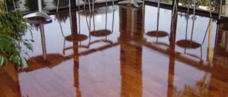
Burgundy color combinations in interior design
Burgundy is obtained by mixing red and brown shades, which gave it its own properties. Red brings energy, luxury, and dynamism. From brown - regularity, calmness, maturity. The colors balance each other, the interior in burgundy tones is magnificent and solid.
An important property of burgundy: it brings objects closer, and when there is a lot of it, the room is perceived as more crowded and dark. Therefore, keep it in moderation and combine burgundy with a neutral palette. Any room is suitable for decoration, except for a child’s room: this color has a depressing effect on the child’s psyche.
Traditionally, burgundy was widely used in the decoration of classic, empire, and art deco interiors, where it revealed its depth. Today, this color occupies its rightful place in a laconic urban style, minimalism.
Options for using burgundy in functional areas
- Living room A profitable solution is to cover the walls with burgundy wallpaper, and choose textiles and furniture in light shades (beige, milky, cream, gray). This combination neutralizes the desire of burgundy to make the room smaller.
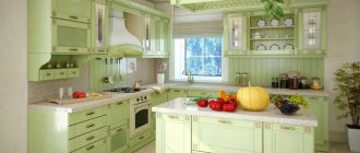
- Bordeaux kitchen is a dark and non-staining color, which is very practical for the kitchen interior. In order not to create an oppressive effect, just accentuate a small room. If the kitchen is more open, you can paint the entire facade with this color. Burgundy is equally appropriate in classic and modern kitchens.
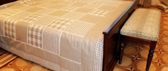
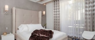
- Bedroom In the design of bedrooms, the presence of burgundy relaxes. Accent use is preferable: textiles (curtains, bedspreads, bed linen), chair upholstery, bed headboards, photo frames, floor lamp. Painted dark walls narrow the space.
- The Burgundy bathroom makes its interior solemn and elegant. To prevent the room from seeming too dark, install more lamps and mirrors.
Features of drawing up color compositions
Burgundy is a warm palette, so its combinations with red and brown look organic. This solution is suitable for spacious, bright rooms. Neighborhood with cream, gray, beige colors will make the interior elegant.
The presence of burgundy red makes it active in any color combination. It is unlikely that it will be possible to interrupt it and push it into the background, even if the design contains only burgundy accents. But when you want to introduce a second rich color into your design, two techniques will help you avoid conflict:
- choose a large room with high ceilings;
- draw a white or light gray stripe between strong colors (our brain will perceive each of them regardless of the influence of the competitor).
Burgundy and white
Next to white, burgundy will take on the color of ripe pomegranate, and the atmosphere will become more optimistic. This is a popular combination, white complements rich burgundy with shine and purity. Usually walls or their individual sections are decorated with burgundy; textiles and upholstered furniture are chosen in the same range. Natural brown and woody shades act as supporting colors, which help get rid of excess pathos.
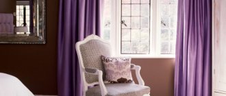
Burgundy and pink, red
A warm, delicate combination, where muted pink tones dilute the richness of burgundy.
This palette in combination with cream looks nice in the design of bedrooms and bathrooms. You can complement the interior with greenish-yellow motifs, and a composition of dark red and burgundy with soft white shades.
Burgundy and gray
A strict but cozy combination with notes of aristocracy is suitable for decorating any area. In a small living room setting, it is better to give the dominant role to a light gray base.
If you combine a pearl gray shade and several red-brown details, the interior will turn out to be restrained and modest. A rich shade palette of gray and dark burgundy furniture will make it solemn and majestic.
Burgundy and black
An extravagant, strict combination that few people dare to make. Used in the design of a living room, bedroom, hallway or office, it brings an element of luxury and drama. Accessories will help soften the gloomy palette: crystal lamps, gilded mirrors, furniture with silver decor.
Burgundy and green
Effective, but only suitable in moderation so as not to tire you. Interior options: burgundy sofas plus a green armchair, burgundy wall and green sofa. Even if one wall is painted burgundy, this will already reveal the color leader.
Bright greenery will not fit into such a neighborhood; use muted shades - light olive, gray-green, green tea, pistachio, asparagus.
Burgundy color in interior design is a warm, rich atmosphere with an emphasis on respectability. Metallic shades, glossy surfaces, gilding and silver will support the idea of luxury in classic settings. A combination of burgundy with neutral or cool colors will create a laconic design in a modern way.
Links
- #800000 – HTML color Maroon
| This is a preliminary article about color. You can help the project by adding to it. |
| Shades of red | ||||||||
| purple color ← See also: pink color → orange color | ||||||||
| Printer's Magenta | Maroon | Lilac, lilac | Red-violet | Rusty | Reddish brown | Sangria | Scarlet | |
| #FF00FF | #FF0090 | #800000 | #E0B0FF | #C71585 | #B7410E | #CC8899 | #92000A | #FF2400 |
| Terracotta | Cinnabar | Amaranth | Pink | Light cherry | Shocking pink | Coral | Pomegranate | Burgundy |
| #CC4E5C | #E34234 | #E52B50 | #FF007F | #FFCBDB | #FC0FC0 | #FF4040 | #F34723 | #B00000 |
Features of burgundy
Burgundy itself is a warm shade, so the ideal and win-win option is to combine it with cream, light gray and beige.
For those who want to add a touch of luxury, it is better to combine burgundy not only with neutral beige shades, but also with gold and metallic silver elements.
Black combined with burgundy will help you create a business style. Of course, for such a combination, the homeowner needs to have some courage, since in this case it is necessary not to overdo it and create an interior in which the room will have a solid, but not gloomy appearance.
Keep in mind that the black and burgundy option is not suitable for every room. For a relaxation room, it is better to give preference to light colors and use shades of red only to divide the room into zones.
Burgundy can be combined with dark green and olive. However, this combination can be tiring, so it is better to use it in those rooms in which a person spends little time, that is, in the toilet and bathroom.
The main condition that must be observed when using burgundy color is measured use, with a sense of faith. You can select it for all rooms, but use it with special care in the nursery and hallway.
You can not only paint the walls in this shade, but also purchase various interior elements, for example, poufs, a sofa. Be careful: excessive use of burgundy can destabilize your emotional state . In order for the psychological state to be stable, burgundy should be combined with calmer colors.
The nuances of decorating a stylish interior in gray tones: see a selection of photos and read the designers’ recommendations.
Read about how to decorate your interior in boho style with your own hands in this article.
Color combinations
Most likely, you have already thought about what color combinations with burgundy in the interior will look appropriate and harmonious, and although burgundy goes well with almost all shades, there are still several nuances.
The most acceptable in this case are pastel shades. Experts note that a combination of gold and burgundy can be an ideal and stylish solution for decorating a living room or bedroom.
If you prefer green, it will look not only appropriate, but also bright. Consequently, such brightness can get boring very quickly, so the combination of these two colors is best used for bathrooms or any others where you don’t spend a lot of time.
The combination of burgundy and chocolate shades has long been a classic, as it is a pretty good choice for almost any room. But if only these two colors are present in the design, then the room will feel dark, so it is best to dilute this combination with intense shades of ivory.
Living room
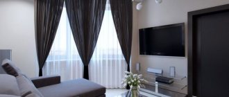
Using burgundy to design a living room, you can achieve the effect of sophistication and prosperity, while the room will look solemn, beautiful and unobtrusively emphasize the high social status of the owner of the house. If you look at the photo of burgundy color in the interior, you will understand how advantageous this color looks.
Very often, golden or silver colors are used for living room design, as this adds a festive atmosphere. But it should be remembered that this combination is acceptable only for rooms with a sufficiently large area.
To avoid excessive theatricality in the interior, it is customary to dilute burgundy and brown with pastel tones, and you should also refrain from decorating the room with antiques or any other accessories that have an ornate appearance.
How to use burgundy in different rooms
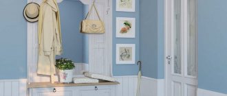
Hallway
First of all, when a person enters home, he finds himself in the hallway. An unobtrusive solution would be to purchase a burgundy-colored pouf or a small rug. Basically, the layouts do not provide for a window in this part of the apartment. Therefore, it is better not to paint the walls burgundy, so as not to create a feeling of oppressive atmosphere in the cramped space of the hallway and corridor.
Living room
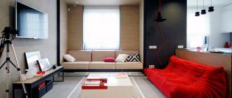
This room is a room where you can relax and receive your guests. The hall or living room can be made colorful and bright, which will cause admiration, and burgundy color in the interior of the living room will be very useful.
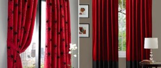
Burgundy curtains in the interior photo
You can use both certain elements in this shade and decorate walls with it. To ensure that the space is not too dark, you should give preference to decorating only one wall with burgundy and maintaining this color with small decorative elements or certain large objects.
Burgundy curtains will look great in the interior; a fluffy carpet in this shade will also highlight the owners’ sense of taste. In any case, such a color accent will attract attention and make the room design stylish, so a living room interior in burgundy is a good solution for a modern, colorful design.
Children's room
As mentioned above, using burgundy color in the interior of a children's room, even with a combination of a lighter palette, is undesirable if you are not sure that you will not overdo it.
When the desire is great, you can use stains in burgundy color, then the interior will not seem gloomy, and the combination of different colors will look more bright and unusual.