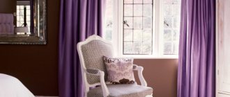
Most of the information about the world around us is made up of visual impressions, and color plays a huge role in the perception of visual images. The ability to notice the slightest nuances has greatly contributed to the survival and development of the human species. Almost all people have a subconscious reaction to color: soft colors of nature calm, while unnaturally bright ones cause anxiety. Given this fact, to create a comfortable interior, it is important to understand the principles of the influence of both individual colors and their combinations on the psyche.
Cool yellow and its shades
Cool yellow is almost the entire pastel range, with the exception of light orange-yellow tones.
Cold tone has a restrained coloring: less intense than spectral, due to which it is widely used in clothing and interior design.
They can be roughly divided into the following groups:
- creamy yellow – pastel range from white-lemon, white-lime-yellow, to white-sand-yellow.
- yellow-green: cold color, in which one way or another there are green notes: due to blue or black.
- beige-yellow, where the blue undertone outweighs the red.
- golden: instead of blue, they contain black (maybe together with blue) and in smaller quantities red.
Cool yellow color photo
- (1) Pale yellow,
- (2) gray-yellow,
- (3) champagne,
- (4) vanilla
- (5) wheat,
- (6) gold,
- (7) honey,
- (8) sandy,
- (9) straw,
- (10) golden brown,
- (11) fawn,
- (12) pear,
- (13) yellow-green
- (14) curry
- (15) dark yellow
- (16) yellow-brown.
Task No. 3.
You came to a cosmetics store to buy lipstick.
You have snow-white skin, bright blue eyes and raven hair.
How to choose the right shade from a rich palette of colors?
The first shade is quite warm and muted; these are the characteristics that representatives of the Autumn color type have. On any cold color types, this lipstick color will not look the most flattering, giving the skin a pale, unhealthy look.
The second version of the lipstick is very bright, but like the first, it has a warm tint and is perfect for girls of the Spring color type.
The third shade, cool but too pale, is ideal for girls of the Summer color type.
The best fourth lipstick color for you, it is quite bright and rich, but at the same time cold, in harmony with your “winter” color.
Of course, cold and warm are relative concepts, some colors seem cooler against the background of warm shades, and warmer against the background of cold shades, so the best way to check whether you have correctly determined the color temperature is to compare it with others.
However, do not forget that the surest proof that you have chosen the right color for your type is your bright and fresh appearance, so even if you have learned to accurately distinguish between cold and warm colors, do not be lazy to apply the color to your face and look at yourself in the mirror.
If against the background of the color you have chosen, your face looks better than without it, then feel free to purchase the item you like. If the positive effect is unnoticeable or if you look worse in the new color than without it, then this item has no place in your wardrobe.
After you have determined your color type of appearance and have acquired theoretical knowledge about the color schemes that suit you, you should learn how to divide shades into warm and cold.
Many of us do not have an artistic education and at first glance are not ready to determine whether a shade is warm or cold.
There are many illustrations on the Internet that show the separation of colors by temperature.
But most of them show only pure colors, which are not so abundant in nature.
Separating colors too roughly will only confuse you. And such pictures will generally form an erroneous idea about colors, because it is wrong to think that the red-orange range is warm colors, and the blue-green range is cold.
How can you learn to determine color temperature?
First, you must understand that colors constantly flow into one another. That, for example, the color red can have both warm and cold shades.
Pure colors can only be found in pictures. In clothing, mixed colors, more complex and deep, are much more often used.
Compare these two shades of blue:
In the first picture, the blue is deeper and more saturated and does not have a white pigment, unlike the second picture, which really smells cold.
About any color, for example, cool purple, you can say “this shade is colder than the other.” Look at these two outfits. In the first photo there is more white pigment and the fabric itself gives the image a cooler tone.
Take a look at the red colors:
These examples show more clearly where the color is cold and where it is warm.
Basically, warm or cold undertones are given by the following shades:
Make the color warm: red, canary yellow or orange.
Cool: white, gray, blue, blue, black or lemon yellow.
When you have an outfit in front of you, for example, green, you shouldn’t immediately remember what color it belongs to. Try to see other shades in it. The first is cold, the second is warm.
Second example of green images:
The first is clearly warmer than the second. We hope you are already able to determine the color temperature.
But don't worry if it's difficult right away. All comes with experience.
Example of purple color:
As you can see, in the first photo the purple is diluted with a red tint, which immediately fills the color with warmth.
So don’t roughly separate colors and think that, for example, if you have a warm color type, blue doesn’t suit you. Just choose shades of blue with warm undertones. For cold color types it’s even simpler; you just need to whiten the warm color with white or darken it with black.
The material can also impart temperature to the color. Matte, suede fabrics add warmth, while shiny fabrics make colors cooler.
Cold or warm yellow color determines the composition of a given tone: if there is at least a small admixture of blue (green) in it, it is considered cold, if there is an admixture of red (orange, brown) - the color is considered warm. Sometimes in a complex shade of this tone there are both echoes of blue and red, then it is weighed: which undertone is greater.
Yellow is considered a warm shade relative to other tones in the spectrum. The wavelength of this spectrum is the third largest (see color physics). The next color in the spectrum is green, which is borderline in temperature gradation. Orange, which ranks above it, is considered the warmest shade of the spectral palette. As the lightest tone, it is very sensitive to impurities, so adding even a small amount of red (yellow + red = orange), blue (blue + yellow = green) makes it much darker, so even a small impurity creates a change noticeable to the eye. And if we are sensitive to halftones, then we can classify them by temperature.
If we take spectral yellow conventionally as a neutral tone (for consideration within the framework of this color), then its light shades will be closer to cold, similar to white (winter). An admixture of black, gray, or blue will give off green and transfer the color in the same direction as white.
Cold and warm yellow have a wide range of shades.
Warm yellow color and its shades
Warm shades of yellow are brighter than cold colors. Rich, full of energy and solar power, they evoke joy, a feeling of summer or spring. There are as many such colors as cold ones; they are designed to decorate this world and give us a positive mood.
These include:
- salty tones are shades of yellow with very little red. These are bright yellow and moderately bright, but rich and flashy.
- yellow-orange - where the presence of a red undertone turns into the perception of orange. These are sweet and spicy shades. They are more restrained than sunny ones: they can be very light, rich or even dark.
- yellow-brown are yellow-orange tones with a drop of blue, which makes the color darker, more restrained, but remains in this temperature category.
Warm yellow color photo
- (1) Sunny,
- (2) apricot,
- (3) banana,
- (4) Yandex color,
- (5) corn,
- (6) signal,
- (7) mustard,
- (8) golden,
- (9) golden oak,
- (10) saffron,
- (11) amber,
- (12) lemon,
- (13) bright yellow
- (14) yellow-orange,
- (15) canary.
Warm yellow color combination
Sweet, juicy, sunny combinations with warm yellow are mostly built on contrast: warm-cold, bright and restrained. Yellow-green tones, brown, red, orange, purple support the riot of truly lemon colors. Blue, cyan, white, gray, black to varying degrees enter into thermal contrast, enhancing the luminous qualities of the main color.
Cold will be different in combination:
Cool yellow color goes well
The cold shades of dawn-yellow winter mornings do not like to argue with the yellow-orange palette, although sometimes you can see such a combination. And yet, next to cool colors such as gray, blue and even green, they look warmer. Subtle contrast is the main concern of this spectrum. This range is not irritating; it is moderately rich and inspires a feeling of roundness and harmony.
HOW TO DETERMINE WARM OR COLD SHADE? (click on the picture)
Task No. 1.
Let's say you came to the store looking for another summer dress.
Fashion magazines and blogs are full of articles on the relevance of green this season, so you stop your eyes on dresses in green colors, but don’t know which shade will suit you.
Knowing your color type (let's take Summer as an example), you want to choose the shade that is closest to your natural coloring, i.e. cold and preferably muted.
Which of the 4 dresses will you choose?
The first dress in khaki is very close in color to the yellow shades of green found on the color wheel and therefore has a warm undertone. This dress will suit the Autumn color type.
The color of the second dress reminds us of the pure green shades on the color wheel, which also have warm undertones. This dress is perfect for a girl of the Spring color type.
The third dress has a rich emerald shade with a cool bluish tint, perfect for the Winter color type.
The last dress in turquoise reminds us of the bluish-green tones on the color wheel, almost transitioning into blue. The shade of this dress is quite cold and muted, so out of the entire assortment it will suit the Summer color type.