Basic rules for combining
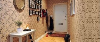
Having decided to hang combined wallpaper for the living room, many people forget about choosing an accent wall, the area of the room, and the features of a particular type of wallpaper.
Attempts to do it on a whim often result in an unattractive design, which can also be facilitated by a lack of experience in gluing.
There are only 4 rules and they are enough to successfully cope with the task:
- You always need to start from the area. Although dark gray is in fashion now, it is contraindicated for small rooms! Dark shades only reduce the area of the room, so in small living rooms only light wallpaper is suitable. In large halls, on the contrary, the tone should be dark. Otherwise the room will seem uncomfortable.
- Volumetric textures. Similar to the previous rule. Their three-dimensional effect will begin to press immediately and the small hall will seem microscopic. Living in it will be uncomfortable. In large rooms there is no such problem.
- Sun side. The combination of wallpaper in the living room requires taking into account lighting. If the apartment is located on the sunny side, then dark canvases are suitable opposite the window and vice versa.
- Horizontal and vertical. If you are lucky with the height of the ceilings, then you should not take a vertical pattern. This will make the room seem even higher, which is not very good. Nowadays correct geometry, both physical and visual, is in fashion. Horizontal stripes only make the room look longer.
Combination errors
The options for combining wallpaper for the living room in an apartment are varied, which causes even designers to make fatal mistakes. It is important to consider that the room does not consist only of walls, it also contains equipment, furniture, and decorations. Therefore, in addition to the rules, you also need to take into account:
- Furniture arrangement. If the wallpaper is a companion wallpaper in the interior with a texture, and the main wallpaper is plain, it is forbidden to block the former with furniture. This accent mistake is very common when for some reason a decorative wall is covered with a wall or a set.
- Multicolor. Large rooms are convenient because even 6 different colors are allowed and it will look normal. In small rooms there should not be more than 3 shades. Otherwise, the volume of the room will simply be lost and it will be difficult to feel it.
- Wallpaper with patterns in long rooms. If the living room is long and narrow, then textured canvases should be on small walls. Otherwise it will be even narrower and even longer.
- Pattern direction. If the room is low, the horizontal direction of the pattern (not necessarily stripes) will make it visually lower.
Combined wallpaper for the living room: interior design
You can combine different types of wallpaper in the living room, combining them in thickness, using materials from non-woven fabric and paper, vinyl and silk-screen printing. All types of wallpaper have their own specific characteristics, so before purchasing them you need to consult with a specialist and inquire about the features of their operation.
The main tasks that a combination of wallpaper can perform in the living room:
- The need to separate individual zones in the design using wallpaper of other textures and tones;
- The desire to visually change the size of the room;
- Opportunity to save money - buying leftovers from 1-2 rolls of several similar types of wallpaper in a store at a discount;
- The need to provide additional protection for individual sections of walls.
When you choose practical wallpaper for the living room, you need to take into account the specifics of all areas in the room.
To correctly combine wallpaper, you need to choose shades that are most compatible with each other - companion colors, the overall atmosphere of the living room depends on this.
For example, orange wallpaper in combination with yellow looks impressive; you can use green with yellow, pink with blue. Blue wallpapers look bad with red or yellow, red with green.
Combining wallpaper requires a lot of attention. The following expert advice can help make the process easier:
Popular combination methods
Now we know the rules of how to combine two types of wallpaper in a living room. This is already enough to make a simple design. But you can take the simple route and use ready-made templates developed by professional designers.
Shades of the same color
This combination of wallpaper is also called monochrome. Perhaps it is the simplest and should be chosen by those who want a calm but interesting design.
The combination of wallpaper in the interior is based on the fact that we take a primary color (for example, blue) and an additional color (indigo, sapphire, ultramarine, cobalt). That's all! They will be combined in any case and you won’t be able to make any mistakes here. But, it is desirable that at least one wallpaper have a pattern. Otherwise the room will be too oppressive.
Before combining wallpaper, it is better to look for large stores. Often they sell canvases from the same collection that are specifically designed for such a combination. It will be easier and more interesting this way.
Contrast
A very effective, but risky way. Contrasting combinations of double wallpaper in a living room is a delicate matter and requires knowledge of at least a banal complementary combination technology. For example, blue and yellow wallpaper is a good option, red and green too.
But here it is important to play with shades and patterns to make the room comfortable.
In addition, the contrasting combination can be divided into 3 subgroups:
- Simple. Combines 2 unidirectional colors. For example, pastel (any colors can be combined with each other) or black and white (extreme opposites).
- Average. Wallpapers, in principle, do not combine with each other, but they can be completed within a single interior.
- Complex. A combination of incompatible shades. It is the most difficult to execute, but many designers know how to correctly set contrasts.
Good photo examples of companion wallpaper for the living room can be seen below. Relying on them, you will be able to avoid the simplest mistakes.
Combination by gluing method
How to hang two types of wallpaper differently? There are 3 ideas on how to glue combined wallpaper in a living room:
- Vertical and horizontal alternation. In the first case, the wallpaper replaces each other after a certain period. In the case of horizontal alternation, the wall is divided into halves by a line. Canvases of one pattern and color are glued on top, and another on the bottom.
- A game of contrast. Contrasting pasting of a small section of wallpaper is quite a good method. In this case, by the way, expensive wallpaper with a high-quality silk-screened pattern is often used.
- Photo wallpaper. They are sold on a large canvas, and it is better to frame them with a frame made of molding or border.
You can see a photo of a combination of wallpaper of two colors in the living room below.
Game of textures
Paired textured wallpapers in one room are the most difficult to combine. The problem is that all canvases have different thicknesses. Even if it is only half a millimeter, the difference will be visible immediately. Therefore, you need to immediately find out their thickness.
Naturally, the colors should be related. Since we are experimenting with texture, there is no point in playing with shades.
It is also worth remembering the rule: paper wallpaper - with paper wallpaper; textile - with textile. You shouldn’t combine them together, if only because they have different densities and thicknesses. It will be extremely difficult to join them correctly.
You can see a photo of the living room with a textured combination below.
The right combination of wallpaper in the living room
Before you bring your ideas to life and choose a color scheme, you need to think about the color combinations that most harmoniously fit into the overall mood of your living room. The “color wheel”, in which 12 colors are arranged around a circle, will help you combine wallpaper correctly. Those colors that are adjacent to each other are the most related and their use for this room will be most appropriate if you want the atmosphere in the living room to relax the people present in it. The colors of opposite sectors can complement each other. Such combinations will make the atmosphere more rich and energetic. Having decided on the color and desires, feel free to combine the wallpaper.
Selection criteria
The main criteria by which you should select wallpaper for the living room:
- Determining the main tone of the wallpaper;
- Selecting the desired ornament;
- Selecting the main type of texture;
- Matching wallpaper to furniture and design.
There are many different interesting solutions that allow you to achieve the most harmonious combination of wallpaper. If you use your imagination, taste and get acquainted with several of them, you will definitely be able to create the perfect living room.
When hanging wallpaper, do not forget to take into account all the nuances. The following material will help you realize your room design ideas:
Other wallpaper combination ideas
Save time: selected articles delivered to your inbox every week
There are no publications on the topic.
Design of adjacent and opposite walls
Decorating adjacent walls of the hall interiors using a combination technique is necessary when it is intended to use a corner sofa in the living room interior. For this, the solution shown in the photo can be chosen.
This combination has a number of operational advantages.
- Firstly, such bright accents set the tone for a certain dynamic. Softer combinations, such as those shown in the bottom photo, on the contrary, reduce the degree of activity and create increased comfort in the interior.
- Secondly, using a combination of different colors, it is easy to visually expand the space, lengthen the length of the walls, raise the height of the ceilings, make the room fill with air, or, conversely, turn it into a small cozy box.
- Thirdly, a combination of wallpaper of different textures helps to mask the shortcomings of the hall, change the irregular shape of the living room, and focus on niches or ledges.
The described technique is often used to save on the purchase of expensive rolls. It is well known that large stores give huge discounts on leftovers. A detailed study of existing examples and photos printed in this article will help you combine them. Such examples are a unique visual book that helps you master the basics of color combinations used in the design of living room rooms. And the next section will easily become a reference book for those who dream of receiving instructions for implementing ready-made projects.
Fundamental points when combining
Quite often, wallpaper in a room is combined to highlight several specific zones : in the living room it can be a reception area, a relaxation area, a study area with a computer desk, a sports area and many others. In modern studio apartments, the living room is combined with the kitchen, so it is extremely important to highlight separate areas in the space, and it is wallpaper combinations that can best emphasize the versatility of these parts of the room.
Tip: in combined rooms, moisture-resistant vinyl or non-woven wallpaper is suitable for the kitchen, and the living room area can be decorated with paper coverings: the different composition of materials in this situation will not be perceived as a disadvantage, since several types of wallpaper are used to decorate fundamentally different areas.
Before making a purchase, think through all the details of the future design. Your choice should depend on many factors: for example, shades are selected depending on the area of the room and the degree of its illumination, textures - with a focus on the style of the interior, and the structure of the materials itself should depend on the negative impact that wall coverings may be exposed to in a particular zone.
By the way, using wallpaper of different textures is the easiest way to create contrast : relief patterns of different styles will instantly catch your eye when entering the living room. Therefore, consider whether such an effect is important to you, or whether it is better to get by with small and inconspicuous wallpaper inserts.
Pre- calculate the footage of the room and decide how many rolls you should purchase . Sometimes wallpaper for combining can be purchased at a discount, so ask about stock availability in specialized stores.
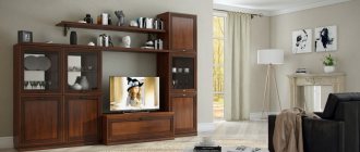
Quite often, combining different types of wallpaper involves using photo wallpaper in the living room as a fundamental element of the interior. The pattern depicted on the photo wallpaper must match the style of the room and its color scheme . In some cases, it is advisable to create an accent wall and use photo wallpaper in bright colors, but if you plan to relax in your living room, use calmer options.
Attention! Photo wallpaper in the living room interior will have another additional effect - transforming the space. For example, scenes with water surfaces, spacious fields or steps will visually stretch your room and fill the room with an atmosphere of freedom and additional space.
Features of living room decoration
Decorating the walls with light companion colors will perfectly refresh a small room with low ceilings. The lighter the design of the main surfaces, the larger the room will appear.
Warm colors help create a cozy and comfortable atmosphere. Dark companion colors visually compress space, so it is advisable to combine them only when decorating rooms with a large area. Examples of decorating a living room using companion shades can be seen in the photo.
Photo: wallpaper companions
You can dilute the pastel on the walls by placing bright accents or harmonious combinations of two or three companion colors. There are a lot of different types of combinations, so you can easily choose exactly the type of finish that will harmoniously interact with the design of your living room.
You can combine different types of wallpaper according to type or texture. Companions that have the same ornament or basic shade look most harmonious. If contrasting colors become companions, then such a living room will be bright and original. The arrangement of paper and vinyl wallpaper on the walls is also quite often used when decorating the living room. An unusual design will be achieved if paper and photo wallpapers act as companions.
You can create a unique design if you decorate the joints of the material using zigzag stripes or waves.
Room lighting and wallpaper color
With wallpaper for the living room, you need to correlate the location of the room. If it faces north and natural light is minimized, this needs to be corrected with colored walls.
Look good:
- warm beige;
- golden;
- lemon yellow;
- cream shades.
Rooms with south-facing windows can be decorated using a cool color palette. Green, blue, and gray wallpapers are allowed.
Types of color combinations
- Contrast. This color combination is used to implement modern interiors. You can choose the most unexpected colors if you place them correctly in the room. Use options - accent wall, geometric patterns, stained glass or panel effect, etc.
- Neutral combination. Opens up ample opportunities for the implementation of original ideas. Delicate shades are suitable for classics, for modern solutions - cooler palettes.
- Monochromy. The use of one color scheme allows not only to visually preserve the area, but also to expand it. There are many combinations, since each color can have dozens of shades. Without overloading the interior, you can zone the space.
- Two colors. The use of two different colors is acceptable for spacious rooms, but other solutions can be considered if both shades are light. It is important that the colors chosen are from one half of the spectrum. The transition is smooth, the gradient method is popular.
The use of several combinations is possible only if the living room area is 25 square meters or more. Then one of the zones can be decorated for relaxation in soothing colors, the other can be decorated for receiving guests, etc.