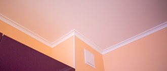
Orange interior
Orange is the second color of the spectrum, located between red and yellow and including both of these colors. Therefore, it has their main characteristics: the passion and activity of red and the calmness and cheerfulness of yellow. Orange is the color of the holiday, associated with New Year's tangerines, sunny beaches, and fireworks. However, orange can be used not only for decorating holiday venues, but also for home interiors. Are you ready to bring a little orange holiday fun into your home? Then let's take a closer look at this interesting color.
Orange color: main characteristics
- Orange color is always warm, it does not have cold shades.
- Orange color in the interior helps improve mood, which has been confirmed by psychologists.
- The orange color in the interior excites and activates – these properties it inherited from the red color. However, orange is not as aggressive as red, and therefore less likely to cause feelings of irritation and anxiety.
- From yellow, orange inherited another property: to create a feeling of well-being and happiness.
- Orange color can visually bring objects closer: orange walls, furniture, accessories.
- Orange color visually increases the volume of objects: for example, an orange lampshade will seem more voluminous than green. The volume of the orange room does not visually increase.
- Orange color is warm, light and even blinding. It’s as if he transfers a part of himself to other objects nearby. So, a white sofa in a room with orange walls may appear creamy, and a mirror in an orange-peach bathroom will create a beautiful reflection, as if magically improving the skin color of the person looking at it.
- Orange color in the interior stimulates brain function, improves appetite, and increases tone. In addition, orange increases the level of emotionality and encourages conversation.
- The neighboring colors of orange are red and yellow; the complementary (opposite) color of orange is blue.
What is contraindicated to combine
The combination of orange with other colors in the interior can be extremely unsuccessful - because of this, the atmosphere of the room can be “sweet,” put pressure on the psyche, be associated with aggression, and cause feelings of discomfort.
Such combinations are still sometimes used, but they are classified as “not for everyone.”
We are talking about combining orange with:
- Violet (the problem is excessive contrast);
- Pink (difficult to choose the optimal shades);
- Other shades of orange (it turns out to be “oil”).
Note!
- Black interior: 160 photos of interesting options on how to use black correctly
Dark interior: 140 photos and video description of how to create a unique style in dark colors and shades
Brown interior - interesting ideas and beautiful uses of brown (130 photos)
What about fashion collections? After all, the listed combinations can be seen on the catwalks! The answer is simple: do not confuse clothes with interior design.
A trendy item carries a message of challenge: you must stand out from the crowd. These things are not worn every day.
Your home interior should surround you with coziness, give you comfort, and create an environment for relaxation: you are in it every day.
Orange color in the interior: main aspects
The amount of orange in the interior
The main use of orange in the interior is accentuation. That is, it is less often used for painting walls and furniture, but more often for accessories, textiles, etc. The introduction of orange accents creates the desired effect - it makes the room more cheerful, warmer, more active, etc., but without having to worry about the pressure of the walls and the irritating effect.
Orange is also used to decorate large surfaces, but here you need to be careful not to cross the line between “invigorates and warms” and “irritates and tires.” Play with shades of orange, combine it with others - and you can enjoy all the benefits of orange in the interior .
The power of orange relative to other colors
Orange tends to crowd out all colors. That is, when entering a room, a person will pay attention to orange objects - be it walls, furniture, carpet on the floor or accessories. The more orange, the less noticeable the color of objects of a different color. This needs to be taken into account. If you want, for example, to make an accent in the living room with your beige upholstered furniture, do not overuse the room with orange decoration - paint only one or two walls this color, and place the sofa against a wall of a different color (for example, gray).
Orange color in the interior: in what rooms and styles is it appropriate?
The classic design rule says that orange is a good color in rooms such as the kitchen, dining room, children's room, and office (home office). Orange is not suitable for rooms where you relax and unwind, for romantic bedrooms, or for rooms that are too bright and hot.
Room styles in which the color orange is most often used: retro mid-20th century (60s style), country, minimalism (including Japanese minimalism), ethnic style (oriental, Mexican, etc.), art deco, avant-garde, pop -art. Classic, Empire, Rococo do not accept orange, but the use of terracotta shades obtained by mixing orange and brown is quite acceptable.
Orange color in the interior as a design tool for correcting room deficiencies
It is worth using orange color in the interior of rooms whose windows face north. Where it is almost always dark and cool, orange will compensate for the lack of sun and create a joyful mood. By the way, sometimes it’s enough to hang orange translucent curtains on the windows - and a dark, cold room will immediately be transformed.
Since the orange color, as mentioned above, tends to visually bring objects closer, you should not use orange to decorate walls in small rooms. This property of orange can be used to visually correct the volume of a narrow and tall room. The orange ceiling will visually lower, causing the walls to visually expand.
Decorator's advice. In orange interiors, the decor of flowers and fruits is very harmonious. Wickerwork, mats, and fiber rugs go well with orange. Orange is the color of autumn, so the presence of various herbarium panels and bouquets of dried autumn leaves in orange interiors is very useful.
Orange nursery interior
Due to its cheerful nature, the use of orange color for the interior of a children's room is almost ideal, especially for children from 2 to 6 years old. It is very important to ensure that your baby’s nursery creates a feeling of security and peace. Therefore, it is better to choose light, orange shades. The tone of the walls in this room can be diluted with posters of your favorite cartoon characters. Good with orange, goes well with green, blue, red, colors.
If you have a sporty child, use orange in his own sports corner. For the best color combination in a children's room, try using it with the following colors: red, yellow, beige but in small quantities.
Shades of orange in the interior
When we talk about the color orange in the interior , we mean, of course, not only pure orange, but also its various shades. Standard orange is not often used for wall decoration - usually preference is given to its more complex shades.
Thus, orange-peach color is popular, associated with freshness. It is also warm and cheerful, but not as active and energetic as orange, so it is great for bedrooms, dining rooms, and bathrooms.
Orange and brown give such complex shades as terracotta, ocher, copper, mahogany. These shades are good for living rooms, bedrooms and offices. They are used to create oriental interiors.
A light tangerine shade would be good in a nursery. Pumpkin, apricot - in the kitchen and dining room. Honey - in almost any room.
In a word, when talking about the color orange in the interior , you should not always mean only orange color. Orange, like red, has many shades. For large surfaces, choose a less energetic color, smoothed out by other tones, and use pure orange for accentuation: pillows, bed linen, bedspreads, lampshades, vases, etc.
There are many shades of orange:
With black
This is the only color in combination with which orange loses some of its playfulness. The interior begins to “sound” deeper and more interesting, it looks strict, graphic, and solid.
This brutal combination is suitable for decorating a “bachelor” apartment, a modern bedroom, a kitchen, or a bathroom.
Orange color in the interior: combination with other colors
What to combine orange with in the interior? It can be difficult to choose the right shade to combine with orange, since the color is not very simple. The main thing is to remember one rule: orange has no cold shades. It is very warm, so it doesn’t go well with cool shades. For example, orange can be combined with blue, but only with its warm shade. Well, now let’s look at all the successful and not entirely successful combinations of orange with other colors.
Orange and white. Great combination. Orange against white creates an association with the sun. White, however, loses a little in its cold, virgin whiteness, adjacent to orange, but it takes on some of the warmth. At the same time, the brightness of orange is enhanced against the background of white. White and orange are a great combination for a minimalist bathroom, living room and kitchen.
Orange and black. Of course, you can combine orange and black, but this combination turns out to be brutal and aggressive. Against a black background, orange begins to burn, blind, and pulsate. This combination is used for modern futuristic interiors, but designers still recommend diluting it with the presence of other colors - for example, white, red or gray.
Orange and blue. People who are far from working with color often cannot imagine such a combination. In fact, orange and blue are complementary colors that can be very friendly neighbors and create a harmonious combination. One rule is to use warm shades of blue. Delicate blue and orange – what does this remind us of? Of course, the sky is on a clear day. Can such a combination be called unsuccessful if it was intended by nature itself?
The combination of complex shades of blue and orange is also reminiscent of the sea, and is therefore often used to create interiors in tropical, Mediterranean, and Provence style. The orange here, of course, should not be fiery, but rather soft - peach, apricot, etc. This combination is also used for Asian ethnic interiors. It is not for nothing that the combination of shades of orange and blue is so often found in the textiles of the peoples of Asia.
Textiles in ethnic style: a combination of orange and blue
Orange and purple. This is considered to be a very unfortunate combination. Never use it in the interior unless you are a super extravagant person prone to crazy experiments.
Orange and green. This is also a natural combination, reminiscent of a flowering meadow. And green in combination with orange reminds us of the New Year holidays - joyful and fragrant. When combining orange with green, you need to remember the rule that shades of orange are combined only with warm shades of other colors. So, we select a warm green shade.
This combination is most successful in the kitchen and dining room , as it reminds us of a basket of fruits: peaches, apricots, oranges and soft green apples. Combine these shades: apple green with one of the fruity shades of orange. For example, if you have kitchen furniture with orange facades, make a splashback from pale green tiles. Lay the floor with tiles of the same color. Combine both of these colors in curtains, as well as in chair covers, napkins and decorative items. The walls can be painted in some neutral, but always warm color (for example, cream or light beige).
Orange and cream. Cream color is very calm. With his calmness he will balance the energy of orange. For example, against a white background, orange will begin to “burn”, and against the background of cream, beige and similar shades, on the contrary, it will “go dark” slightly. This combination is often used when decorating walls: for example, 1-2 walls of a room are painted orange, and other walls are painted cream.
Orange and grey. This is also a good combination. A light gray shade, like cream, extinguishes the brightness of orange and slightly neutralizes its activity. Moreover, these colors do not contradict each other, but coexist quite harmoniously. The combination of gray and orange is universal in terms of its impact on the psyche - both energetic and very calm people will feel comfortable in such interiors.
By the way, you can combine orange with cold gray: this combination is used for modern high-tech interiors. This alliance is usually used only in kitchens.
Orange and hot pink. No, not the best combination, difficult for the psyche.
A combination of orange with similar shades. This is an option for lovers of monochrome interiors. You can take several similar shades of orange - darker and lighter - and combine them with each other. For example, pale apricot walls, honey-toned parquet flooring, an orange sofa and warm golden-colored wooden furniture. Add here accessories in terracotta and other complex shades of red, brown, yellow, and your interior will turn out warm and unobtrusive, reminiscent of an autumn park.
The combination of wall color and furniture upholstery, as well as carpeting
If you choose orange walls, pay attention to upholstered furniture in light green, light blue, beige, light gray and white. In this case, you can choose a carpet or carpet in dark gray, brown, green, blue and even reddish.
If you want to place orange upholstered furniture, paint the walls white, green (if the upholstery is light orange, not bright), light blue, gray.
When choosing shades, focus on the color wheel: combine shades that are in the same inner circle.
A few design nuances
The orange color in the living room interior will be very appropriate as a background design if the room design is made in a colonial style. It will serve as the personification of the hot sand of the Sahara and the fiery red African sunset, which, against the backdrop of colorful national motifs, will allow you to recreate the ideal atmosphere of this style. It is especially good to combine this color for the living room with blue or turquoise, which, in combination with sunny shades, will evoke an association with a blue sky over sandy expanses.
It is better to decorate the walls in an orange living room with peach-colored wallpaper, which will smoothly turn into golden. This wall decor will be complemented by beautiful paintings in stylish frames with imitation gold. You can lay a bright orange carpet on the floor. Orange accessories should certainly be evenly distributed throughout the living room, adding their own brightness to every corner of the living room. This “spraying” will create the most effective atmosphere
, impressive in its sophistication. The pinnacle of such an orange kingdom can be an orange tree placed in the corner of the living room.
Orange color in the living room charges with vigor and optimism. The main thing is to choose the most suitable color combinations
, without being afraid of bold experiments.
Remember that the best design option is the one that will inspire you and give you bright emotions. You can carefully examine more than one photo of the interior of an orange living room, but only your vision of such a design, combined with competent recommendations from Westwing designers, will allow you to find the best option
- harmonious and at the same time satisfying all your needs! Stay with us and create the design of your dreams, guided not only by excellent taste, but also by the competent recommendations of our stylists and designers!
See all photos on the topic “Orange color in the interior” (photos are clickable):
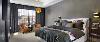
Bright colors in the bedroom: shades
The main feature at this stage is that there should be a competent and rational use of no more than two bright tones, despite the fact that there are already neutral colors.
However, various combinations of color shades are allowed in the bedroom; the main thing is not to overdo it.
It is clear that the main place in the bedroom belongs to the bed. At the same time, most designers consider the bed to be one of the main decorative elements.