If the kitchen is white
The white color of the countertop for a white kitchen is one of the most common options that can often be seen in the interior.
And it is no coincidence: this combination makes even a small room much more spacious, and significantly adds air to the atmosphere. Moreover, it is not at all necessary to follow the “tone on tone” rule: it will be enough if the shades of the working surface and facades are as close as possible to each other.
If you already have enough white and you don’t want to turn your kitchen into a blinding room, you can use the rule of contrast and make an accent countertop: graphite, black, dark brown.
A milky or white kitchen with a dark countertop will significantly diversify the color scheme, and the dark color will become a saving accent to restore balance.
Combinations of tabletop and apron
Should these parts be the same color? Designers' opinions on this matter differ radically.
Some people think that contrasting duets look impressive, while others, on the contrary, try to combine details that are similar in color, and also choose matching floor coverings. But wouldn't such a combination be boring?
A combination that many find boring
This option is often chosen by those who make repairs themselves, because both elements can be made from the same material, which means there will be no difficulties with slight differences in shades and textures.
In addition, such combinations do not visually “fragment” the interior. This solution is suitable if you want to emphasize the walls - for example, you chose wallpaper with eye-catching patterns.
For those who think that such combinations are too banal, you can lay out the backsplash with multi-colored tiles, and choose one of the shades of the tiles for the countertop.
An interesting effect can be achieved if the color of the floor echoes one of the colors of the tiles
Designers are happy to experiment with different tones of the same color, but it is much more difficult to achieve harmonious and interesting combinations on their own. But if you are confident in your impeccable taste, then you can try this option, trying to choose shades that are as close to each other as possible.
IMPORTANT: To visually enlarge the space of a tiny kitchen, designers choose kitchen sets and aprons in light colors, without large drawings, photo printing or complex patterns. You can opt for materials with horizontal stripes - they will help expand the kitchen visually.
When choosing materials, it is also important to consider the interior style of your kitchen. If it is in a rustic style, then give preference to a beige countertop.
In this case, aprons made of panels or tiles that imitate wood look nice. Aprons of most colors are suitable for a white tabletop, but for a beige one it is better to choose brown, green or turquoise details.
If you like modern style, then pay attention to white brick backdrops. In eco-style, natural materials are used - the tabletop can be made of wood, but it is better to choose discreet finishes for the rest. A win-win option is white with light wood.
How to choose the right kitchen countertop color
There are many different colors of kitchen countertops, so it is important to know how to choose the right shades to pair with the main elements. We suggest using the advice of professional designers:
- Focus on the color of the facades. There are two options: tone on tone with facades, in accordance with the color scheme of the lower/upper tier or individual modules. Finding the perfect “hit” is very difficult. This is due to the fact that the material used to make the facades and countertops is different, so its texture and, therefore, the visual perception of color are also different. Perhaps the only exception is white and black headsets - there are no difficulties with them. But remember that it is advisable to “dilute” such monochrome with bright accents, for example, a contrasting wall panel or one with an original pattern. If the colors of the facades of different tiers of the kitchen set are different, then choose a shade of the countertop to match one of them. This solution always looks harmonious and impressive.
- Make the apron a visual extension of the countertop. It is very simple to implement this option in practice; it is enough to use the same material for the manufacture of the working surface and the wall panel. And in this case, you won’t have to worry that a “conflict” will arise between the shades of the countertop and the apron. The “matching” elements of the headset look neat and complete. There is an alternative option: if the apron is lined with tiles or colorful artificial stone, you can complement it with a tabletop, the shade of which matches one of the colors used in the wall composition. Such a solution will look very non-trivial.
- Connect the flooring and countertop. Is there a parquet board on the floor? Then you can safely choose a countertop whose color imitates the same type of wood. Are you using porcelain stoneware or tiles for the floor? Then you should pay attention to countertops made of natural or artificial stone.
We suggest you read: How to remove advertising stickers and traces of glue from household appliances?
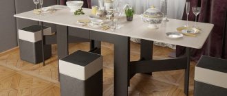
- Involve a dining group in the interior design. A universal solution is to make the working surface of the kitchen set and the tabletop from the same material. Such combinations look very “easy”, but at the same time make the interior holistic. You can combine the shade of the work surface not only with the dining table top, but also with chairs, sofas, banquettes and any other pieces of furniture.
- Make simple decisions sophisticated. Plain countertops look laconic and strict, and to prevent them from looking “boring”, it is enough to choose materials that imitate natural stone. Light stains and inclusions will not be particularly noticeable at first glance, but upon closer examination they will pleasantly surprise you with their discreet but unusual design. There is one more advantage: on such working surfaces, not only crumbs and stains are less noticeable, but also mechanical damage, abrasions, and scratches that inevitably appear over time.
How to choose the color of the countertop to match the kitchen set?
The color of the countertop for the kitchen set is in a neutral color: white, black, beige, gray, wood
A white kitchen set will suit a neutral countertop, imitating stone or wood in color and pattern. For a white kitchen, a cold stone color is preferable: black or gray. If it is an imitation of wood, then let it be light. Dark wood will put pressure on a white kitchen, and it will lose a significant share of its elegance.
On the contrary, it is better to complement a beige kitchen set with a dark wood or chocolate colored countertop - it will set off the facades, making their creamy shade even more delicate and “sweet”. Mirror scheme: brown fronts - beige top.
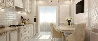
A white and beige kitchen can be complemented with a countertop, the color of which is almost identical to the facades. This move will preserve the visual lightness of the light kitchen, its “fragility” and “weightlessness”. One of the features of such a composition will be femininity.
A dark countertop, on the contrary, will make a light monochromatic kitchen more brutal. It will emphasize the purity of the color of the facades, adding a contrasting effect to the set. A cream or beige kitchen, as already mentioned, can be complemented with a dark wood-colored countertop, and the best partner for a white set will be a black countertop.
A black countertop in a white kitchen is a luxurious option that has many admirers. This kitchen furniture looks elegant and, of course, expensive.
Another secret will help you decide on the color of the countertop for a white and beige kitchen set: you need to take into account the “apron” of the work area. If everything is light - the facades, the apron, and the tabletop, the overall picture will turn out “blurry”: the elements will merge and lose the clarity of shapes and lines. If you want a light countertop, make the apron, if not a contrast to the kitchen, then at least stand out against its background. If the apron is already decorated in light colors, complement the kitchen set with a contrasting countertop.
It is not advisable to pair a black kitchen set with a black countertop - the furniture will turn out too dark and gloomy for the kitchen. If you like this combination, make the apron light. Otherwise, as in the case of a light kitchen, everything will merge into a single spot.
A black kitchen and white countertops are a win-win solution. It is just as luxurious and elegant as the opposite option (white fronts - black top).
In addition, a black kitchen set can be complemented with a countertop that imitates the color and pattern of light wood (will add warmth and comfort to the black kitchen) or gray stone (will add visual high value).
Kitchens with gray facades are equipped with countertops in white, gray (a couple of shades darker or lighter than the facades) and black. Marble and other stone tops in achromatic tones look great.
For a kitchen with wood-colored facades, white, cream and wood-colored countertops are suitable - the same or different in several tones. A combination with a black countertop is possible, but it is more risky. Expensive solid wood furniture can be equipped with a stone countertop with the appropriate color and pattern.
Another option for neutral and conditionally neutral kitchens is colored countertops. Yes, the solution is unusual, but extremely effective. The ideal basis for a colored top is a kitchen with white facades. An accent tabletop adds brightness and cheerfulness to a light interior. Where can I find a colored countertop? Look in the catalogs of manufacturers of laminated “tables” or place an individual order for a top made of acrylic stone, which can be given any color at the request of the customer.
Worktop for colored kitchen
Colored kitchens are complemented with neutral countertops: often white, beige, marble, wood, less often black.
It is worth considering the saturation and “temperature” of the color of the facades. A warm-toned set (in shades of orange, yellow, red, etc.) will go well with a tabletop in cream and brown tones.
With a cool-colored set (in blue, light blue, green, lilac and pink tones), a gray or “marble” tabletop will look impressive.
A white top will be successful in any situation. It should be borne in mind that a white “table” will make the kitchen more elegant and delicate, while a black one will make it more brutal and much darker.
Countertop color for a two-tone kitchen
Today, kitchens that include two colors are in fashion: one for the bottom row, the second for the top. What to combine the tabletop with? If the set combines two neutral colors, the shade of the tabletop is usually close to the upper modules, and contrasts with the lower ones.
For example, for a kitchen with a “black bottom - white top” scheme, a white countertop is most suitable. In such a headset everything is harmonious and balanced. The same goes for beige and brown kitchens.
It is not at all necessary for the tabletop to match the top. For the top, you can choose a shade that is something between the color of the top and bottom: for example, if the hanging cabinets are cream and the cabinets are wenge, a café-au-lait-colored tabletop will fit perfectly into their company.
However, other variations are possible. It is quite acceptable for the top to match the color of the lower facades, merging with them. Decide for yourself which color scheme seems more attractive to you.
If the set combines neutral and spectral colors, the tabletop should not add nuances, much less dominate. Let her be a “gray mouse.” Depending on the color of the facades, the choice can be made in favor of white, light “marble”, cream, beige and gray appliances. In addition, the color of the “tabletop” can match the lower facades. It is advisable that the “apron” does not stand out too much. Facades rule here!
Nuances when choosing a color
Experts say that the color of the kitchen space and, in particular, the countertops should be chosen depending on how you want to feel when coming to the kitchen. To do this, you need to know a few nuances about choosing a color scheme: 1. If you want to feel calm and neutral in the kitchen, then the atmosphere should be created in blue and green tones. These are the natural colors of greenery and water, and people always feel comfortable in nature.
2. To create a warm atmosphere, you need to choose a beige or peach shade for the table if the kitchen windows face north.
3. Bright colors - orange or turquoise, will create an atmosphere of good mood and increase appetite before eating.
4. A light-colored countertop is perfect for a small space. It will visually increase the volume and will look good with cool colors of furniture, especially if the windows face south.
5. Warm yellow color makes the interior pleasant and immediately catches the eye, especially if the kitchen is chosen in darker colors.
6. The white color of the countertop creates a feeling of cleanliness and sterility. But this purity is quite difficult to maintain in its initial state. Therefore, the surrounding design is selected in a different color.
To understand which countertop is suitable for the kitchen, you need to think through the entire design of the room in advance - decide on wallpaper, flooring, kitchen furniture.
Choice of colors for countertops under the set
Since the set occupies a significant part of the room area, it is better, and easier, to choose the color of the coating of its lower cabinets. Let's take a closer look at the most popular examples of decoration.
For a neutral headset
Neutral colors mean sets of white, beige, wood, gray or black. How to choose the color of the countertop for the kitchen and not make a mistake with the choice? The instructions will tell you what to do.
- White kitchen . In combination with a snow-white set, it is better to use a neutral top; materials with imitation stone or wood will also look ideal. If you choose a top for stone, it is better to give preference to black or gray; for wood, you should choose light colors.
General principles of selection
I would immediately like to formulate the main principle of choice, which applies not only to the tabletop, but to any interior detail in general - this is the absence of inappropriateness. That is, if, having chosen something, you have no idea how it will fit into the interior, do not take this thing, material, accessories, no matter how much you like this item.
Now let's figure out what principles should be followed when choosing a kitchen countertop.
- Decide on the style of your kitchen. Will it be a state-of-the-art space with glossy black and white surfaces? Or maybe you like cozy Provence with its printed chintz and pastel colors? Or a creepy and rough loft? In any case, the tabletop should become part of the interior and fit perfectly into it.
- Choose a countertop that matches your kitchen set. It is unlikely that a silver steel countertop will decorate a brown oak set. Exactly like wood is not suitable for high-tech furniture.
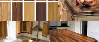
- Decide on the material of manufacture. Today on the building materials market you can see countertops made of natural and artificial stone, solid wood, fiberboard, chipboard, plastic, glass, and stainless steel.
We suggest you familiarize yourself with How to get rid of pills: 95 photos of ways to remove pills without damaging clothes.
Study the prices for the selected material, familiarize yourself with its pros and cons, and color scheme.
- Count the money. Take the amount you planned to spend on renovations and divide it among all the necessary purchases. Then take a look at what countertop you have currently chosen - its material, color, price and answer your own question: does it fit into the budget? Or perhaps it’s worth looking for a countertop made of cheaper material? For example, you chose natural marble, but after studying market offers, you realized that this option is not suitable for you at the moment. In this case, consider options made of artificial stone with suitable colors. This way, you can save money and implement your plan without losing the chosen style.
Creating a kitchen interior
Perhaps you want to visually enlarge your kitchen.
Create a kitchen interior in a light tone - it expands the space. Cool shades (blue, green, purple, lilac) will fit perfectly into the interior if the kitchen windows are on the sunny side. If the kitchen windows face north, we advise you to give preference to warm colors (peach, beige, soft pink).
Glass countertops have high moisture resistance and do not absorb grease.
Countertops in marble and gray tones are combined with the “cold” façade.
Light colors will create cleanliness and tenderness in the kitchen, while dark colors will bring brutality. Bright red color is an extravagant solution.
Stone-look countertops are popular.
It is not necessary to purchase an expensive countertop made of granite, quartz or marble, because today products made of artificial stone are in great demand.
They are original, practical and durable. Manufacturing companies offer a rich palette of shades; moreover, the stone is plastic and can be processed in any way.
A built-in sink made of the same material will ideally complement the composition of the work surface. The dense structure of the material does not provide soil for the development of microorganisms.
Light shades
A practical solution for the kitchen is a light design of the countertop. Let's figure out how to correctly combine shades with kitchen items:
- Beige and cream are backgrounds for light aprons and sets. They look incredible when they border snow-white furniture.
- Sandy and warm bronze shades are the choice for light brown or dark facades. Perfectly emphasizes the wood design.
- Metallic is suitable for high-tech style. Creates a futuristic interior, not very practical, but beautiful.
- A light brown countertop is suitable for a classic design. A dark set will set off well.
- A golden hue will give a luxurious look to black and white furniture if its fittings - handles - are of the same color.
- Light gray design is not universal - it will look harmonious with white, gray and dark gray furniture. It is advisable to choose aprons in the same color scheme as the countertop.
We invite you to read: Washing machine does not fill with water: 8 reasons, repair
Grey colour
It cannot be unambiguously classified as either light or dark: it all depends on its shade. Countertops of a gray (steel) color can often be seen in high-tech interiors. It is quite practical, the color is beautiful and unobtrusive, and perfectly sets off color accents.
Fans of “cold” interiors will definitely like gray.
Those wishing to choose a countertop from the “dark” list should take into account one nuance: if your kitchen space is small in area, it is better to choose a lighter option - dark colors “narrow” the space. It is also not recommended to choose dark fittings for owners of a kitchen of non-standard proportions: any errors, corners, or recesses will be immediately visible. If you do not want to focus attention on them, give up the gloomy color scheme.
What should a kitchen countertop go with?
Designers have long gone beyond the complete identity of the range in the interior, so it is not at all necessary to strictly combine the tabletop with other objects of the same color. A feeling of completeness is created if in the kitchen the table or chairs, window sill, even plant pots or dishes have something in common with the work surface. For the rest, you can give free rein to your imagination.
If you can’t decide on the color and texture of the working surface, you can trust the specialists of E-stoun.ru. A full cycle production of countertops is organized here, from the development of a design project to the installation of the finished product on site.
Colored kitchen
For lovers of brightness and unusualness:
- Lilac and violet colors stimulate the appetite and look good in the Provence style. The apron can be mosaic or plain, the main thing is not dark.
- Yellow shades will attract attention, but they should not be too much. A bright kitchen and a yellow countertop will be enough to keep your eyes from getting tired.
- Orange is a warm, cozy color. It can be used in small kitchens with white cabinets, as well as in rooms where you need to add light.
- A red tabletop will successfully decorate white and dark facades.
- Pink is a surface color for silver, white and pink kitchens. It looks interesting and a little provocative. Glossy pink will complement the high-tech style.
- The blue countertop will harmoniously blend into the Mediterranean style. Catchy shades will create the perfect contrast with white floors, furniture fronts, and appliances.
- Green color is multifaceted - its light green shades will look good against the background of white, light gray and light brown pencil case and apron. An olive tabletop will complement the Provence style. Bright grassy tones will look better with white and cream kitchen furniture.
Black
This is one of the most controversial colors for countertops. On the one hand, stains from food or drinks will definitely not be visible on black, but on the other hand, any scratch will immediately catch your eye. Therefore, if you prefer a countertop of this color, carefully choose the material and texture. A black tabletop with small specks or stains will be much more practical than a plain glossy one. One of the most beautiful options is the “royal opal” color (yellow-golden stains on a black background).
Countertops made of artificial stone.
Working surfaces made of acrylic (artificial stone) look great and have performed well. Of particular note are the high-quality and reliable surfaces of the famous brands TRISTONE from Lion Chemtech and LG HI-MACS (South Korea), Corian from DuPont (USA), Montelli (China). These are leaders in the production of artificial stone for the kitchen. We have established close cooperation with the South Korean company Lion Chemtech: Santex-Mastera is the official representative of this company in Russia. We have the opportunity to sell TRISTONE coating at affordable prices.
What are the benefits of acrylic countertops from the best manufacturers?
- They are highly resistant to water and moisture.
- Over the course of many years of use, they do not change color when exposed to sunlight.
- They are not affected by various food acids and alkalis, and household dyes.
- Completely safe and harmless to health.
- They lend themselves well to restoration and renovation; various scratches can be removed yourself using fine sandpaper.
- Highly hygienic, have no pores.
The manufacturing technology of acrylic composite makes it possible to connect elements without seams, to combine the countertop and sink into a single whole, due to which there is no accumulation of food residues and dirt. Working surfaces made of acrylic surprise you with a variety of color shades and a wide choice of decor (more than 200 samples). The texture can be glossy or matte. Such abundance is an inexhaustible resource for designers and stylists. You can make a surface of any shape for kitchens of different sizes: radius, corner, island, bar.