White kitchens: pros and cons
It’s no wonder that white color in the interior has become so popular in the last few years. And it’s not just about fashion, but also about its properties. Let's see what are the advantages of using white in design.
- Visually expands the space. For owners of a small kitchen, this solution will be especially relevant.
Expert opinion
Irina
Irina Polyakova is the founder of an interior studio, architect and interior designer. The main area of work is kitchen design
You need to be careful when using white in poorly lit rooms - with small windows or windows facing the shady side. In the absence of good natural light or in cloudy weather, white can have a dirty or gray cast. To avoid this effect, dilute the interior with other light, warm shades and bright accents.
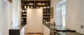
Small white kitchen
- White is easy to work with. He has already helped out more than one designer. After all, almost all colors go well with it.
You can be bolder in choosing bright colors for accents.
If you don’t want to make a mistake with the choice of colors, then a neutral background for the interior in the form of white is the best solution.
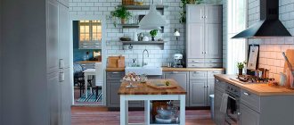
A bright apron in the form of brickwork against a background of snow-white furniture
White looks especially impressive with deep blue, turquoise, mint, mustard, purple, emerald, orange and coral.
- Versatile - fits any style. White is equally good in both modern and classic interiors.
- Never get tired of it. And if you get tired of it, you can always change the color of the apron or the design of the handles: and now the kitchen is as good as new.
- Compatible with any equipment. If you need to build a coherent ensemble, choose built-in equipment or a matching set.
Many Russian celebrities also love white kitchens - presenter Ksenia Sobchak, designer Masha Tsigal, producer Yana Rudkovskaya, actress Anna Khilkevich.
Interior of the snow-white kitchen-living room of Yana and Evgeni Plushenko. This is the favorite color of the famous couple. The kitchen in the mansion on Rublyovka is also made in light colors
Kitchen of actress and TV presenter Anna Khilkevich from the Maria factory
Is white always so good? Under certain conditions, even its advantages can turn into disadvantages. Let's see what the disadvantages and when it is better to stop using white in the interior.
- Poor lighting. In a room with small windows, pure white can make the room feel cold and uninviting.
- White doesn't like saving. Cheap white paints, due to their low density, can give an undesirable sheen. And cheap white facades will quickly reveal dirt accumulated at the edge.
- Too much white will make the interior gloomy and lifeless.
- For textured and embossed facades, white can be a real problem. If the surface is poorly washed, then caring for such a set will bring a lot of trouble.
See also useful video reviews about white kitchen :
Advantages of a white glossy kitchen
- You can add different shades to this design and the room will seem harmonious. White kitchen is like a blank slate for designers
- An ideal solution for a small apartment. White color will visually expand the room and give it lightness
- Externally, this design is very simple. Your morning in this kitchen will start with positive emotions due to the abundant light
- An accent can be created using any color or unusual furniture design. This will help break up the monochrome and prevent the room from becoming “sterile.”
- Inside the kitchen there can be different shades of white (beige, light pink, gray, etc.). But the single color scheme will remain solid
- White color is always in trend. It is available in different styles: minimalism, gothic, hi-tech and even in modern author’s directions
How to add some flair
Every housewife dreams of an individual design for her kitchen. With a white room this possibility exists. All it takes is one detail to turn your room into a work of art.
- You can “play” with different textures. Wallpaper in the style of tiles, wood or stone looks interesting. The ideal combination of white furniture with natural wood laminate
- The following shades will help make your kitchen soft and airy: milky, creamy, creamy, pearl and mother-of-pearl.
- Glass with a dark furniture element will add style to your kitchen. You can use the chrome effect
- Hang a large, bright painting in a prominent place; an art portrait is ideal
- Focus on furniture. For example, rich stools of simple shape
- Fresh flowers, especially palm species, will add even more purity and air.
Materials
Designers do not limit their customers in the choice of material for a white kitchen. There is a large selection of different options:
- Plastic. This is the most budget option. But with any scratch, the presentation will deteriorate and the damaged part will have to be replaced.
- Tree. It is certainly stylish and beautiful, but requires careful preparation and further care. This is the kind of material that professionals choose for their homes.
- Stone. The most durable material for the home, but the cost leaves much to be desired. It is precisely because of the price tag that many refuse this option.
- Combinations. The combination of materials looks cozy. However, harmony must be maintained, so as not to overdo it with any texture, it is better to contact a specialist
The kitchen is a traditional room for the whole family. You need to approach the choice of color carefully; take care of warm shades so that your kitchen does not turn out cold and lifeless. If you create the design correctly, you will be very pleased with the atmosphere of the room.
Practical white color
Few people would dare to make their kitchen white. There is a myth that this is impractical. Why a myth?
- On a white surface, spots are less noticeable than on a colored surface.
- The white kitchen design is smooth, making it easy to clean up dirt
- White color will always be presentable
- Easy to clean, you can easily wipe all the fittings with a damp cloth
Style selection
White, thanks to its versatility, can be paired with almost any style. In such as Scandi, for example, it is a calling card. And in art deco or classics it can serve as an auxiliary one - to create color transitions.
Modern
A white set will always fit harmoniously into the modern interior of a kitchen, kitchen-living room or studio. There are no strict limits in choosing the design of facades or handles. This is an ideal basis for any experiments in choosing an apron, wall color, floor, etc.
Classic and neoclassical
Is it acceptable to use white in a classic style kitchen design? In some cases, it is not only acceptable, but also necessary. For example, when you need to lighten the elegance and pretentiousness of a traditional interior in a small kitchen.
For a small kitchen, neoclassical or urban classic style, combining traditional and modern design elements, is more suitable.
Light set with a milky tint in “Stalin” style
Expert advice
Irina
Irina Polyakova is the founder of an interior studio, architect and interior designer. The main area of work is kitchen design
The classic style does not like saving on materials. Expensive premium solid wood facades really cannot be compared with anything. However, from some reliable manufacturers you can purchase good quality MDF furniture that is not inferior in appearance to premium furniture, but at a lower price.
Minimalism
Where else can you see white so often, if not in minimalism? Perhaps only in scandi and hi-tech. A white set is an ideal base for creating a calm, monochrome and strict interior. Facades without handles, matte or glossy, lack of decorations - a light kitchen in the minimalist style looks so ascetic.
If you are afraid that the design will turn out to be too cold and uncomfortable, add wooden surfaces.
Scandinavian
It was with this style that the great popularity of white began. And it was Scandi that debunked the myth among many that this color turns the interior into something like a hospital ward.
Thanks to the use of natural wood in the design, decor in the form of wicker napkins or baskets, bright accents in the form of green, red, blue or yellow, a bright Scandinavian-style kitchen looks very cozy.
A matte set with paneled or smooth facades is suitable. Gloss is rarely used in Scandinavian style.
Loft
This style is eclectic, which means it is not forbidden to use white furniture. The set can be either ultra-modern or with an antique effect. It doesn’t matter what the facades are - you can choose matte or glossy, with panels or smooth. The main thing is to create a creative atmospheric space in an industrial spirit.
High tech
White is the ideal base for creating a monochrome kitchen in a high-tech style. This style is characterized by the shine of metal and glossy surfaces. Therefore, you can safely choose a set with glossy facades.
The set must be functional, preferably with built-in equipment. There is no decor on the facades, and even handles can be dispensed with by setting the push-to-open mode. But with a light surface, this solution is not the most practical. As an option, you can choose facades with integrated (hidden) handles or profile handles.
Options for handles for high-tech headsets
Provence
For Provence, a light set with aged paneled facades, with a light yellowish or milky tint, with a gold or silver patina, is suitable. Copper or brass colored handles will look great.
Matte or glossy - which facades to choose?
The choice of matte or glossy facades is not only a matter of taste, but often also of practicality.
To weigh the pros and cons, we compared two types of facades. The results are in the table below.
| Parameter for comparison | Matte | Glossy |
| Which ones are easier to care for? | It is more difficult to remove dirt, especially from a textured surface. | Easier and faster to clean the surface. |
| On which ones is dirt more noticeable? | Fingerprints are not as noticeable. | Fingerprints are more visible. The problem is solved with the help of well-chosen handles, in which the contact with the surface of the facades is minimal. |
| Lighting requirements | There are no special requirements for lighting (other than its sufficiency). | Incorrectly directed lighting can ruin the entire interior due to glare that irritates the eyes. |
| Room size | Versatile. | Glossy facades can visually expand the space in a small kitchen. But (!) subject to properly organized lighting. |
| How to choose depending on style? | Matte facades are appropriate in any style. | Glossy ones are inappropriate in traditional, classic interiors. |
| Where do the windows face - on the sunny or shady side? | Once again, matte is versatile. And in a kitchen with windows facing south, it is preferable to use matte surfaces. | If there is a lot of sunlight in the room most of the day, then glare from gloss can be annoying, but where there is not enough sunlight, gloss will come in handy - it will compensate for its lack. |
| Fashion | The trend towards naturalness dictates its own rules - matte ones look more organic and do not irritate with their active shine. Matte surfaces are more popular now. | It is worth focusing on fashion if it does not contradict common sense. If elegance is simply necessary, or the use of gloss is dictated by the chosen style (art deco, for example), then why not give preference to it? |
Pros and cons of gloss
For lovers of glamor, a glossy kitchen is an ideal option. Bright, flirty and spectacular with its shine, it will visually increase the space and make the room more spacious, so this kitchen is an ideal solution for a room with a small area. However, it is very important not to overdo it with shiny surfaces, so as not to spoil the interior with its excess.
This kitchen looks original, but in order for it to always look impressive, it requires special care. Unlike matte surfaces, glossy surfaces get smudged very quickly; all water splashes, fingerprints and other unpleasant stains are clearly visible on them, which must be constantly dealt with. Therefore, when choosing glossy facades, you need to be prepared to constantly rub them. Although there is an alternative option - this is pearlescent gloss, which also leaves marks, but they are much less visible.
Color combinations
White is a great base. And against its background, you can build color combinations, guided by a simple rule - no more than three colors at a time.
You can create monochrome interiors by adding gray, black, ivory or milky to white with varying degrees of saturation. Another option is to create contrasts and diversify the white kitchen with bright accents - blue, red, orange, etc.
We will tell you further about which colors white goes best with.
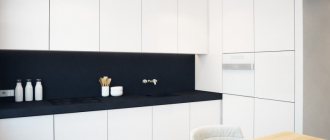
Black and white
A classic combination that can turn out to be quite aggressive if it is not softened with small amounts of color accents or surfaces with the texture of natural materials (stone, wood, concrete).
A colored apron diluted the dark white interior
Black and white kitchen in minimalist style. Brick wall softens the contrast
White-green
This combination is considered one of the most successful and favorable for psychological perception, because nature itself created green in a variety of shades. The color of lush summer grass, turquoise, light green - all shades harmonize equally well with white facades.
In green you can make an apron, walls, curtains, a kitchen sofa or chair covers. The photo below shows successful design ideas with different shades of green.
A set without upper cabinets with a green accent wall
Interior with pale green walls and emerald tiles on the floor
With a tree
Using wood in its natural form in the interior will help get rid of the coldness and asceticism of white.
Combination with wood-effect fronts
With facades imitating light ash wood
Wood can be used in the design of countertops, floors, and even walls (for example, decorate one of the walls with wooden slats or build a partition from them in the kitchen-living room).
With wooden worktop Kitchen with wooden bottom
Spectacular combinations with bright and complex colors
Some of the most beautiful combinations of white with:
- purple and lilac;
- orange;
- red;
- blue, cyan and their shades.
.
Gloss and shine in the interior
The fashion for gloss appeared recently, and I immediately fell in love with it. Its main advantage is originality, chic and style. Thanks to the fact that manufacturers produce models in different colors and shades, the trend becomes universal and is suitable for any interior. Mirror coating looks expensive, and with one color or another you can create a certain atmosphere. For example, white in the bedroom will add romance, and red in the kitchen will increase appetite. Black will add nobility.
Light and pastel shades of a glossy surface, such as soft pink, ivory, olive, will add lightness, freshness, and beauty. Glare on the furniture will create the effect of expanding the space - thanks to the sun's rays or artificial light, the room will seem larger and brighter than it actually is.
Rules of care
The fears of home owners that glossy furniture is difficult to care for are in vain. To avoid damaging the top layer, wipe the furniture twice a month using a special cleaning agent. But not more often, as aggressive components can damage the furniture. On other days, you can use a regular semi-damp cloth without using chemicals. It would be enough.
Such a different gloss...
For which rooms is furniture with a glossy surface suitable? Ideal for the kitchen, living room, bedroom or bath. Choose dark or bright colors for the kitchen, and light shades are an excellent solution for the bathroom. Glitter visually enlarges even a small space. For a child's room, choosing gloss is not the best idea, since there is a high risk of quickly ruining the interior.
Selection tips
A glossy kitchen can impress anyone! But when planning, keep in mind that there should not be too much shine. Add matte options for the workplace, place a table with a matte effect, and the fronts of the cabinets would be appropriate in a glossy version. In any room where you have such colorful furniture, follow the principle of one accent in the room. To set off glossy furniture, choose a matte ceiling and walls.
Don't get carried away with mirrors - they can enhance the effect of shiny surfaces and make being in the room uncomfortable. Pay attention to metal objects, plastic or glass - with them, glossy facades will sparkle in a new way and make the interior more attractive and interesting.
When choosing glossy furniture for your home, keep in mind that it needs good natural or artificial lighting - only in such a situation will it “open up”. And to enhance the reflection effect, buy light options. Gloss can enlarge even a small space, the main thing is not to use dark wallpaper!
White kitchen interior design
A kitchen in white tones is the basis for experimenting with the decoration of walls, floors and ceilings. Before choosing materials, decide on the general color scheme in the interior. Decide for yourself which of the principles of color combinations in the interior is closer to you:
- monochrome – when 1 color and its shades are used;
- contrasting - when shades located opposite each other in the color wheel are combined (blue and yellow, green and red, etc.);
- harmonic - a combination of neighboring colors on the color wheel.
In addition to the principles listed above, there are many other combinations that the color wheel allows you to create.
It is not advisable to use more than 3 colors at the same time. But you can use different shades of them.
Decoration of walls, floors and ceilings
Based on the chosen color scheme, it will be easier to choose the design of materials for finishing the walls, floors and ceilings.
- How to decorate the walls?
If the kitchen is small, then it is better to decorate the walls to match the kitchen unit: this way the furniture will look visually lighter. For decoration, you can choose white wallpaper (paintable, textured, or with a pale and barely noticeable pattern). Another option is decorative plaster with a brick texture, light concrete or any abstract, simple pattern.
Expert advice
Irina
Irina Polyakova is the founder of an interior studio, architect and interior designer. The main area of work is kitchen design
A light set allows you to implement cool ideas with an accent wall. One of the walls can be finished with brickwork, painted with colored paint or covered with wallpaper with a pattern, a bright pattern or photo wallpaper.
With a brick wall
The most win-win and practical option for wall decoration is washable paint on decorative plaster, waterproof washable vinyl-based wallpaper. As for the choice of shade, the universal option is walls in neutral light colors (milk, ivory, peach, beige, light gray) depending on the chosen interior color scheme.
If the kitchen does not have upper cabinets, then an empty wall can be made an accent by decorating it with a bright apron up to the ceiling, pictures or shelves with beautiful dishes.
- How to decorate the floor?
A win-win option for finishing the floor is wood (laminate, parquet or porcelain stoneware that imitates natural wood texture).
A white or very light floor (marble, jellied, tile) will not reveal the dust that has accumulated over a couple of days, looks impressive (especially marbled) and with a white kitchen creates the effect of endless and airy space. Is this always a good thing? It all depends on your own perception and on whether such an interior is diluted in the right amount with other shades.
A more versatile, calm and practical option for finishing the floor is tiles in calm tones (porcelain stoneware or PVC), wood-look, brown or with a discreet pattern. The shade of the material can be selected to match the walls, apron, and countertop.
What if you focus on the floor? A bright, spectacular and contrasting pattern or pattern on tiles in combination with white facades is not such a risky solution if you keep the rest of the design in neutral colors and do not go overboard with the decor.
- How to decorate the ceiling?
The best solution for a small kitchen with white furniture is a matte white ceiling or with a satin sheen.
The most universal option in all cases is a white matte stretch ceiling.
You can use other light and unobtrusive shades - cream, light beige, milky, etc.
A high suspended or painted ceiling in a classic kitchen can be decorated with stucco.
Colorful, bright, glossy ceilings have gone out of fashion and are only appropriate in a large room. They are very difficult to work with for someone inexperienced in design, so it is better to stick to traditional finishing options.
Read more about which ceiling to choose for the kitchen in our separate material - go to.
Tabletop
The most successful countertops with a white kitchen look like wood, natural stone with a pronounced pattern, white, gray and dark.
The choice of countertop is determined not only by the color of the kitchen set, but also by the style, design of the apron and the overall color scheme. For example, in a classic interior with patinated paneled facades, a countertop made of natural stone will be in harmony.
In the Scandinavian style or in Provence, a wood-look countertop looks very harmonious. High-tech loves contrasting combinations of white and black, so you can choose a dark countertop, but you need to take into account the difficulty of caring for it. The white countertop is universal and suitable for any modern interior.
The apron and countertop can be made in the same design. If you need to focus on the apron, then the tabletop can be made neutral white, matching the color of the set.
Colored countertops are a rarer, but possible option. In this case, a bright colored tabletop can be made to match the apron or stand out against a general neutral background.
Yellow bright countertop against the background of a white kitchen. The apron is discreet in design and does not distract attention from the main accent.
Blue tabletop in the interior
Apron
The choice of an apron is determined by the task: to emphasize it or, on the contrary, to leave it discreet and neutral.
A white kitchen set removes the limits in choosing an apron design. You can be bolder in the selection of materials, colors, and patterns. But at the same time, take into account the size of the room, for example, in a kitchen-living room of 20 sq. m, both a matte or glossy hog and large tiles of bright colors will look great.
If the kitchen is small, then do not choose an apron with a three-dimensional pattern or a 3D pattern, even against a white set.
A bright apron with a pattern or design can be supported by the same colors in the design of the dining area or in decorative items - flower pots, curtains, wall frames, etc.
An interesting idea - a combination of a yellow apron with a base of the same color
The main thing is the principle of moderation. If the apron acts as a bright accent in the interior, then the overall design should not argue with it and draw attention.
A textured apron imitating wood, concrete, brick, or stone looks creative with a white set.
If it is necessary that the apron does not stand out from the general background, you can choose tiles, porcelain stoneware or a panel to match the facades or in a similar shade as its finishing. To prevent the design from looking too boring, choose the original shape of the tile or highlight it with contrasting grout, such as in the photo below.
Curtains and textiles
Curtains and textiles are the main tool in transforming a white kitchen. Curtains, upholstery of kitchen chairs, armchairs, sofas in the kitchen-living room set the character of the interior and its atmosphere. When choosing the color of your curtains, consider the overall color scheme and style.
In a traditional monochrome or neoclassical interior with a white kitchen, brown, beige and similar shades will look beautiful.
In a modern style, you can experiment with bright, rich colors of kitchen curtains and use them to create accents.
Expert advice
Irina
Irina Polyakova is the founder of an interior studio, architect and interior designer. The main area of work is kitchen design
For a small kitchen, you should not choose lush and richly decorated curtains. In a modern interior, it is permissible to completely abandon curtains in favor of roller blinds, which will perform only a practical function - protection from the bright sun. This will make the white kitchen even more spacious and let in more light.
If the interior already contains a bright element, then it is better to “dissolve” the curtains in the space by choosing an option that matches the tone of the set or walls.
Furniture and appliances
Any appliance goes well with a white set.
Furniture with a built-in refrigerator or oven will cost more. And with a white kitchen, a freestanding white refrigerator will seem to disappear into the background, and you will be able to save money without sacrificing design.
Colored, black equipment and with a metallic tint will also look good.
Island hood with white glossy kitchen
Small kitchen with glossy facades without handles. Non-trivial solution - white hob
Against the background of a snow-white set, you can highlight the dining area using dark or bright colors, which will allow you to zone it without resorting to a kitchen bar. Seat covers or cushions, as well as colored upholstery of chairs and armchairs, can fulfill this role.
Always a universal option - a dining table with a white tabletop of simple shapes and chairs in natural wood or basic colors.
Depending on the area and shape of the room, the configuration of the headset can be straight, U-shaped, corner, double-row parallel, island. White is equally suitable for any layout.
Corner configuration of kitchen furniture in Khrushchev with a bar counter-window sill
Direct layout of the kitchen unit. Notice how light the top of the kitchen looks: some of the wall cabinets have been replaced with shelves
Island kitchen with yellow accent backsplash
Straight kitchen without upper cabinets. An empty wall allows you to highlight the hood and focus on it. Black handles and accessories, paintings in black frames with mats, contrasting grout on the tile seams help emphasize the black hood
A rational solution in a small kitchen is to make a white set under the ceiling to increase storage space. In combination with white walls, light furniture will not burden the space.
Kitchens that are almost identical in size are visually perceived differently. In the second case, thanks to the upper cabinets under the ceiling, it was possible to free up space by the window
Furniture gloss
Modern furniture in the Art Nouveau style is almost impossible to imagine without glossy surfaces. Thanks to the development of technology and the emergence of a new generation of finishing materials, glossy surfaces are characterized not only by an attractive appearance, but also by enviable strength and durability, comparable to the overall service life of the entire cabinet furniture product.
At its core, “glossy” is just the ability of a surface to reflect light falling on it. The more such light is reflected, the more glossy and shiny the surface appears to us. Since the attractiveness of furniture is determined by the degree of gloss and brightness of the facade, manufacturers are finding new ways to obtain high-gloss surfaces. The most advanced products are distinguished by almost one hundred percent reflection of light. The second important characteristic of a glossy surface is hiding power, that is, the ability of the facade surface to hide defects characteristic of super-flat surfaces, for example, scratches or settling dust. Modern materials, however, almost always provide a sufficient degree of hiding power.
In addition to the general aesthetic appeal, glossy surfaces have a number of significant operational advantages:
- Perfectly reflecting light, such furniture makes the most cramped and poorly lit rooms visually spacious. In addition, you can optically expand certain areas of the room, effectively achieving architectural balance in the interior.
- Glossy facades are very resistant to mechanical damage and adverse weather conditions. In addition, smooth surfaces are very easy to clean.
- By combining glossy and matte surfaces, you can create original compositions that add additional dynamism to the interior of your apartment.
Thanks to the rapid progress of technology, new ways of creating high-gloss coatings are emerging, each of them having its own advantages and disadvantages, but all of them are characterized by excellent gloss and durability.
Among the most promising technologies are:
- Polyvinyl chloride film. The simplest and cheapest method is sticker and vacuum molding of PVC film, however, despite the low cost, this approach allows you to obtain a fairly durable and reliable surface. However, under harsh operating conditions, with sudden changes in temperature or high humidity, this film is prone to peeling off from the furniture body. In addition, PVC material does not have a high degree of light reflection, so the gloss will not be very bright.
- Postforming, or glossy plastic. Acrylic plastics are significantly brighter and more opaque than PVC film. The basis of such a facade is chipboard or MDF, the front sides of which are covered with a layer of plastic, but the end surfaces are protected by other, less expensive materials. This facade has excellent strength, however, at the junction of the plastic with the ends, moisture can penetrate into the thickness of the facade, leading to damage to the chipboard or MDF material, which leads to premature deterioration of the product, despite the preservation of the glossy surface. In addition, it is not recommended to wash such facades with chemically active cleaning agents.
- Painted facades. Through careful painting, sanding and polishing, an almost perfect glossy surface can be achieved. However, this is achieved through a long and labor-intensive technical process. This requires preliminary priming, multiple layers of varnish or enamel with mandatory sanding of each layer, final sanding, and ultimately labor-intensive polishing of the resulting surface. The highest quality gloss requires final treatment of the facade with wax. All this makes furniture with painted glossy facades quite expensive, but the remarkable appearance and almost absolute durability will certainly justify the increased costs.
Despite the indicated vulnerability of some types of glossy surfaces, you should not be afraid of purchasing such furniture. Any room furnishings require careful treatment, and mismanagement and indifference can destroy any furniture, even those made of steel.
Today, durable and aesthetic glossy furniture is becoming available to almost any buyer. Choosing furniture with glossy facades will create an original and bright interior. In addition, glossy furniture will look good in small or poorly lit rooms.
However, when purchasing such furniture, you should not forget about careful use, and then the elegant glossy surface will delight you for as long as you like.
Lighting
All the positive qualities of white in the interior can be crossed out by improperly organized lighting. It is especially important to create uniform, multi-level lighting in a kitchen with glossy facades.
For a white glossy kitchen, choose diffused light lamps. Otherwise, glare cannot be avoided. Such lighting can be created by a central chandelier, built-in overhead or spotlights, local and wall light sources - sconces, floor lamps, etc.
It is necessary to organize lighting in the work area, in the center of the kitchen, in the dining area. If the set has built-in display cabinets, their lighting will create an additional decorative effect. For the kitchen-living room you may need sconces, floor lamps and table lamps.
In a small kitchen, it is better to abandon pendant lamps and large chandeliers and use uniform spot lighting in a suspended or suspended ceiling. The more lamps, the better.
In medium-sized and large-sized rooms, a large and bright chandelier can become the main decoration of the interior, standing out well against a neutral, light background.
When choosing lamps, give preference to options with neutral white light so that the shade of the furniture does not change under artificial lighting at night.
Advantages and disadvantages
Main advantages:
- The kitchen is visually enlarged.
- The room appears brighter due to the reflection of light from the facades.
- Large selection of colors.
- Even dark colors, which in a matte finish will appear rough and gloomy, look aesthetically pleasing.
- Glossy finishes are easy to clean.
Flaws:
- The facades are not entirely practical - stains, stains, streaks, and fingerprints remain on them.
- Sensitive to mechanical stress.
- They require regular wiping to maintain their appearance - up to 2 times a day.
- Care is carried out with specialized products; ordinary detergents are not suitable.
In addition to the general pros and cons, kitchens with glossy facades have features due to the material of manufacture:
111
- The most practical and economical material is plastic (postforming). Resistant to household chemicals and high temperatures. The downside is that scratches and minor defects cannot be repaired.
- PVC film – advantages, low price and easy to clean with household detergents. Cons: It can fade and peel under the influence of high humidity and temperature.
- Painted facade, protected with a layer of varnish. Minor defects can be corrected, but chips can form if you are not careful. The cost is higher than in the previous two cases.
Glossy suspended ceilings in the kitchen with glossy facades of kitchen furniture are not appropriate.
The walls should also be kept in calm color tones and made matte. It looks elegant when the upper shelves and cabinets are glossy and the lower ones are matte.
It is worth knowing that the most glossy furniture should not have catchy patterns or pronounced texture.
White kitchen decor
Decor in the form of house plants, vases, tableware in display cabinets, beautiful dishes or a wall collage of family photographs can make even the coldest and gloomiest white kitchen feel homely and warm.
The more neutral the background is (white walls + white furniture), the more options there are in choosing decorations. And vice versa - if the interior is already very active, then the decor should be minimal.
Not so long ago, carpet mats came into fashion.
Care Tips
A white kitchen gets dirty no more often or less often than any other. But dust and stains on light-colored facades are less noticeable than on colored ones and, even more so, on black ones. The complexity of maintenance largely depends on the material from which the facades are made. As we wrote above, glossy surfaces are easier to care for; for embossed, paneled, milled ones - it’s more difficult.
To make the cleaning process as simple and time-consuming as possible, try to adhere to the following recommendations.
- If you have not yet purchased furniture and are just about to install it, then at the design stage it is important to ensure that the edge of the tabletop extends beyond the facade by 40-50 mm. It would be good if the back side of the countertop had a drip tray.
- Wipe the facades and work area regularly, without waiting until the dirt becomes visible. It is better to do this every time after cooking and washing dishes.
- After each cleaning with a damp cloth, be sure to go over it with a dry cloth to prevent plaque from forming.
- If the facades are already heavily soiled, use professional products designed specifically for cleaning kitchen furniture.
- Never use sponges, brushes or abrasives.
- Yellow water deposits on light-colored facades can be washed off with a professional detergent.
Home remedies made from soda, vinegar and other handy ingredients should be treated with caution: some of them are strictly contraindicated for certain materials.
Specifics of glossy kitchen
Gloss can give a room freshness and depth, and light, shiny panels can make even the cramped kitchen seem larger.
But, before purchasing, you need to decide whether the glossy kitchen facades will fit into the overall interior design - not all styles will look funny and pretentious. Thus, shine is not typical for Provence, where specially aged surfaces with scuffed effects are more welcome.
In its pure form, gloss is not suitable for interiors made in a classical style - instead of severity and visible lines, it will create the opposite result - lightness and freedom. Mirror panels are also not suitable for pompous baroque kitchens - it is better to use facades with a mother-of-pearl effect.
Glossy headsets are ideal for the styles of our time - minimalism and hi-tech. Panels of bright colors can serve as the basis for an avant-garde kitchen.
If you want to create an expensive and chic interior, give preference to panels of dark colors.
Undoubtedly, a glossy kitchen is aesthetically pleasing. But many buyers are concerned about the productivity of such a solution. As a rule, the operating properties of facades depend on the material of the product. Most glossy facades are thermo- and moisture-resistant, but require special care to maintain their attractiveness from the outside.
