The issue of choosing the color of curtains is no less important than choosing a style. A correctly selected color scheme will help to visually expand the space, make the room brighter, or, conversely, steal the last rays of the sun. In order not to make a mistake, you need to be guided when choosing a general rule: bright and warm colors help add light, while fresh and cool shades cope with excess sunlight.
Curtains are a decorative element that allows you to change the appearance of a room with a minimum of effort and expense. Therefore, you should not treat the purchase of window decor in the same way as a new sofa. Even if after five years the sofa remains, then changing the curtains to suit new fashion trends will help change the interior at any time.
What to combine curtains with?
There are no strict rules governing the choice of curtain color. No designer will tell you: “Choose the color of the curtains to match the color of the wallpaper” or “Buy curtains to match the upholstery.”
Curtains may not match anything in color at all, but fit into the interior in style, texture, ornament, style. Of course, such a bold step requires design flair. If you find it difficult to choose the color of curtains , listen to our advice.
How to choose the color of curtains: a few simple rules
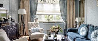
1. To save money. For thrifty owners, it is recommended to choose the color of curtains and drapes to match the furniture upholstery , and not as is customary in most families: they made repairs, glued fresh wallpaper, and then changed the curtains to match their tone. Wallpaper changes more often than furniture, and its price is not commensurate with the current cost of furniture and the curtains themselves.
The color of the curtains matches the color of the upholstered furniture
If saving is not part of your plans, you can safely choose curtains to match the color of the walls.
Curtains to match the color of the walls
Curtains to match the color of the walls in the bedroom
Pink curtains to match the color of the walls. Photo from housetohome.co.uk
2. Win-win. If there are a lot of colors in your room, so you get lost and don’t know what to combine the color of the curtains with , choose a fabric for window draperies whose color practically matches the color of the largest piece of furniture in the room (large sofa, carpet on the floor, kitchen fronts, bedspread and canopy in the bedroom, etc.). It's a win-win move.
The color of the curtains matches the color of the kitchen facades
Curtains, bedspread and canopy are the same color. Country style bedroom
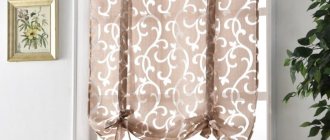
3. In neutrality. If the interior is not designed by a stylist, and you have doubts about your own design abilities, you can choose neutral shades of curtains (sand, cream or beige), which are always in fashion. In this case, it will be quite easy to change the style and mood of the room without changing the curtains.
Neutral color of curtains in the bedroom, which is supported by other interior elements and textiles. Changing the mood of this room will not be difficult.
4. Color connection. By choosing a neutral shade of curtains, you can connect them with other interior elements of a darker, lighter or brighter color: for example, decorate the window with additional colored drapery or lambrequin, or make curtains with colored edging, etc.
Neutral-colored curtains with a splash of color for the tie
5. Window in the spotlight. If you want to draw attention to the window and take your eyes off another, not the most successful component of your interior, choose bright curtains, preferably not plain, but striped, checkered or printed. Combine the interior components with bright curtains: make a tablecloth, napkins, sofa cushions, floor lamp shade, etc. from the same fabric. Buy other accessories in the same color and pattern as the curtains.
Bright curtains in a bright, “neutral” bedroom. The color of the curtains is supported by pillowcases and bedspreads, as well as the upholstery of the chair
6. Multicolor. If your interior is polychrome, that is, it contains a large number of colors, give your eyes a rest by choosing not very bright plain curtains to match the color of all the walls or just one wall (if a combination of colors was used in the decoration of the walls).
7. Monochrome. If you want to create a monochrome interior, it is not necessary to choose curtains whose color exactly matches the color of the walls and/or bedspreads, upholstery and other textiles. Choose curtains that are not identical, but a similar shade, or choose two-tone curtains so that the window stands out rather than blends in.
A good choice of curtains for a monochrome bedroom
A good choice of curtains: the monochrome is not broken, but another shade is unobtrusively introduced into the interior - green, while the curtains do not merge with the walls
And one more piece of advice not related to the color of curtains: the simpler and smaller your curtain, the more expensive the fabric from which it is made should be.
Selecting curtains for blue wallpaper
Curtains are undoubtedly a wonderful addition to the entire interior and, at times, a necessary element of the window. However, more and more often people make some mistakes when choosing them, getting confused by the variety, colors and not taking into account the style of the room. It is important to choose the right curtains depending on the design features of your room, the color of the wallpaper and furniture.
Curtain color and room size
It's no secret that the overall impression of the room depends on the color scheme. You can visually expand a 7-meter kitchen, as well as hide the “extra volume” of a large living room. To do this, you just need to choose the right color of curtains .
Warm colors from violet-red to yellow create the effect of enlarging and “bringing” the window closer.
Colors included in a cool color palette visually distance the object. Curtains, for example, pearl, blue, lavender, soft green and other shades can help achieve this effect.
Light colors make the room wider, while dark colors make it appear smaller.
Beautiful combinations
Blue with blue - looks very calm, fresh and harmonious. Such curtains can be glossy, matte, transparent and velvet.
Blue and olive are a pleasant combination that harmonizes well with the golden pattern.
Blue and yellow are spectacular, bright and fun. But you need to work with it carefully, as it can make pale blue walls darker and dull. Therefore, you should choose the right shade.
Blue and burgundy - such curtains will become a powerful accent, which at the same time will create a cozy and inviting atmosphere in the room. This is a good solution for those who want to focus attention on the window. And it’s better to combine them with interior accents.
Light blue and dark blue - curtains are well suited for the bedroom idea and will harmonize perfectly with white bed linen, dim lighting giving charm to the furniture and creating a reflective atmosphere in the room.
Idea No. 1
Blue and silver is a royal combination that was used in the colors of the clothes of the rulers of Europe. This option requires a predominance of blue, which can be diluted with small inclusions of silver. It can be: printed pattern, stripes, applique.
Idea No2
A good stylistic solution would be to combine blue wallpaper with black curtains, which will emphasize the individual character of the room. This option is suitable for a large room with a lot of light. Black curtains will emphasize the effect of cold air and add mystery and mysticism, creating an elegant image of the room.
Idea No 3
Blue wallpaper will go well with gold printed curtains. It is desirable that it ideally matches the shade of wallpaper or furniture. Gold and blue wallpaper will create a comfortable, harmonious space. You can also extravagantly combine them with shades of other colors used in the room design.
The blue color is original and looks impressive in interiors and is combined with pleasant tones, which are most often used when building an interior. It provides an opportunity to imagine and bring to life various unusual design ideas. Choosing curtains to match blue wallpaper is not at all difficult, and many leading experts like to use this color, creating light and fresh rooms in which it is pleasant to be, relax and welcome guests in various directions.
purpose of the premises
For a bedroom, which is considered a relaxation area, it is advisable to choose muted shades that will not interfere with relaxation. Flashy and bright colors are only possible in accessories. Pleasant green, dark blue (but muted), creamy gray and pearl tones have a good relaxing effect.
Curtains for the living room can be very different , here the flight of imagination is not limited, the main thing is that the color of the light tulle curtains and curtains fit harmoniously into the overall color background of the room. This is exactly the room where vibrant experiments are possible.
Curtains for the kitchen play an important role, since in most cases this room is quite small in size. The color scheme of the curtains depends on the chosen interior style , it can be “country” (usually light curtains with pastel stripes and checkered patterns or with bright patterns - floral, bird, etc.), “hi-tech” (minimalist curtains with a cool shade ) or classic (plain curtains of any suitable color or two- or three-color striped or checkered curtains).
Country style kitchen curtains
Country kitchen curtains
In most cases, the main canvas of the kitchen is made light enough to provide access to the sun, and its framing completely depends on the wishes of the owners. A dark curtain in the kitchen is possible, but it is usually a lambrequin curtain or a Roman blind - that is, the window decor does not interfere with the passage of light into the kitchen space.
Bright Roman blinds in the kitchen
We select curtains for different wallpapers
Blue wallpaper can be either plain, monochrome, or with some kind of print.
With an image
If your wallpaper has some kind of pattern on it, the situation of choosing curtains becomes a little more complicated, since the image on the wallpaper itself must be taken into account. If it is not clearly expressed or has the appearance of a strip, then light curtains will come in handy. If there are flowers painted on the wallpaper, then choose curtains with the same pattern, only larger in size. This way the space will look more harmonious. An excellent option would be curtains that have the same pattern as on the walls, only on a different background, in order to brighten up the monotony that would certainly appear with the same background on both the walls and the curtains.
With ornament
If your room has bright, textured wallpaper, which has been popular lately, then choose curtains in a brighter shade with the same texture. This way you will achieve a competent color scheme and unity of style, without disturbing the harmony with unnecessary inappropriate brightness and incorrectly placed accents.
Curtain colors and color combinations
It is clear to everyone that even the most persistent proposals, no matter what fashion trends they are regulated by, will not be heard if the residents of the premises categorically do not like the proposed color. You shouldn’t be led by fashion: remember that you should like the color of the curtains , and you need to build on this and select the shade that will be most suitable for a specific design.
Choice of curtain color: white curtains. Despite its ability to expand space, in its pure form white color is too aggressive, so it is better to soften it with any additions of pink, coffee or beige or combine it with other colors.
Choice of curtain color: yellow curtains. The color yellow is believed to stimulate mental acuity and productivity. Its bright shades visually expand the space, so curtains of this color are good for the living room and office.
For the bedroom and kitchen, it is advisable to use calmer tones.
Yellow curtains are good for a children's room, especially if its windows face north. Psychologists recommend hanging “sunny” curtains in the room of a melancholic child.
Bright yellow pairs well with green and white, but its more neutral tones that fade into beige will work with other colors as well. The combination of yellow and blue is also successful.
Choice of curtain color: green curtains. Although green curtains are most often used in living rooms, soft shades of green are also suitable for dining rooms. This color calms and induces peace, so green curtains can also be hung in the bedroom.
Choice of curtain color: turquoise curtains. This color has not gone out of fashion over the past years, but demands respect. Bright shades of turquoise look good with a decent frame (for example, in a living room with expensive furniture), while light midtones are suitable for a child's room.
Dining Room By Jonathan Adler for Liz Lange
It is best to use turquoise color in curtains not as part of a single fabric in order to maintain a sense of proportion, but as an additional color accent. In this case, a combination with gilding is suitable.
Choice of curtain color: blue curtains. Blue is a softened version of blue, it is calming, and therefore blue curtains are well suited for the bedroom. To prevent the room from looking dull, it is worth adding accessories such as pillows or paintings in warm colors - they will make the room more comfortable.
Blue curtains. The blue color in the interior relaxes, making the room feel cooler. It goes perfectly with white, like most colors, but in such a set it looks very cold. Shades of yellow and beige will help soften this effect. Blue in a single design “extinguishes” the light, creating a feeling of darkness.
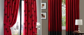
Choice of curtain color: red curtains. The red color for curtains in its pure form is rarely used because of its brightness. The abundance of red puts pressure on the subconscious, and it also hides the size of the room. But in combination with warm shades, muted red is perfect for the living room.
If the bedroom has furniture made of natural wood, then it will also be emphasized by light red organza or similar decor of shadow curtains.
Choice of curtain color: orange curtains. Orange is the opposite of red, it refreshes any room and looks good in children's rooms, living rooms and dining rooms. A stylish and noble solution is the terracotta shade, which is at the height of fashion.
Orange curtains in the bedroom
From apartmenttherapy.com
Selecting curtains
Curtains for windows are almost the same as clothing for a person, so you need to choose them wisely. It is enough to choose the right tone and fabric pattern, and the room will acquire exactly those qualities that it lacks. Of course, in some cases, designer flair helps to choose the right curtains, but more often than not, even experienced specialists resort to simple rules. For example, is it possible for the wallpaper and curtains to match in tone? If the room has blue wallpaper, what curtains would be more appropriate? Of course, a match in tone is not excluded in the following cases:
- If you need to maintain the unity of space. But most often, designers suggest choosing a wallpaper tone that is several units darker, or, conversely, lighter (blue wallpaper - blue curtains).
- If the wallpaper has a pattern or design. Thus, the presence of a pattern or ornament on the canvas allows a combination with plain blue curtains.
- If you need to visually move the wall with the window. Well, to visually bring the wall with the window closer, you need to prefer brighter, more intense shades of curtains.
- If double window decoration is expected (tulle and curtains). In this case, one of the window design elements should be as close as possible to the tone of the walls. For a blue shade of wallpaper, you should choose snow-white tulle and blue curtains, or you might prefer blue tulle and aquamarine curtains.
Roman blind that does not block the passage of light
Gray color in the interior: features of color and its effect on humans
The design of modern apartments and offices is increasingly dominated by a palette of gray shades. They are used not only as individual decorative elements, but also as the main color scheme for walls and ceilings. Properly diluted with bright splashes of gray, it adds sophistication, lightness, and calm. This shade is most common in rooms designed in high-tech, loft, and minimalist styles.
Gray color looks best on walls, which means this wallpaper is the best option for any room.
Depending on which notes complement the gray color, its range is determined. Blue and blue undertones have cool shades. In warm ones, red, brown and yellow tones will be visible.
Such walls need an appropriate shade continuation, otherwise the image of the room will look unfinished.
A warm range of gray, diluted with splashes of soft green, turquoise, pink, and orange, will help add additional light to the room and expand its volume. You shouldn’t give up on more saturated shades, such as wet asphalt, graphite, and stylus. They will fill the room with special comfort, giving it elegance and romanticism. A classic combination with white will be a win-win. An interior made in this style does not require addition with bright objects. It will look light and sophisticated.
This option is ideal for a reception room.
A stylish children's room, decorated with a predominance of gray, can be decorated with various bright accents. Raspberry, light green, beige, azure, blue will serve as an excellent addition to the basic shades.
When choosing curtains, always place accents correctly.
In workrooms, classrooms and offices, a combination with white, brown, purple, and blue would be appropriate. This combination, abundantly supplemented with glass and metal, will affect concentration and increase performance.
Any room should have no more than two or three dominant colors and, possibly, one bright accent.
The versatility of gray allows it to be used as an ideal background for both kitchens, bathrooms and living rooms. Depending on the needs, goals and mood, the room can be easily diversified with the help of bright accents in the form of elements of furniture, decor and textiles.
Choose a few more colors to complement the gray and decorate the room in them.