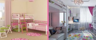
Blue Dream
Blue is the color of coolness, purity and freshness. These associations make it the favorite color of those designers who prefer to create light and very bright interiors in a modern European style. However, blue has other advantages: it calms and pacifies, relaxes and charges with optimism. These qualities have allowed blue shades to take a leading place in the palette of popular tones for the bedroom.
Is a blue bedroom simple and naive? It also happens. However, much depends on how exactly this color is used and what color partners it interacts with. Let's talk about using blue in the bedroom and successful color combinations.
How to paint walls in a bedroom with dark furniture
In the case when the bedroom furniture was purchased before the creation of the interior project or came to the owner in another way that required its mandatory use, it is necessary to adjust the rest of the design to it. Dark furniture must be installed in a large room or combined with light surfaces. Otherwise the atmosphere will be oppressive.
Light walls, floors, and ceilings will save the situation. Designers recommend combining only cold or warm colors in one interior. According to this principle, starting from the dominant color of the furniture, you can choose the tone of the walls. The situation is simpler if dark furniture has an abundance of glossy surfaces. Even in dark shades, they will reflect and multiply rays of light, giving the room mystery.
To combine walls and furniture in one composition, you can add patterns of colors that match the shade of the furniture on a light background. A bedspread or upholstered furniture upholstery looks impressive if it repeats the pattern of the walls and the tone of the bed frames, cabinet fronts, and cabinets.
These simple tips will help you create a mysterious world in the bedroom, allowing you to indulge in pleasant thoughts or go to the kingdom of Morpheus at the end of a hard day. The furnishings of the room and the right shades will help you forget about the hustle and bustle at least for the duration of your stay in your boudoir.
Factors influencing the choice of color in the bedroom
When creating a certain interior composition in the bedroom, it is necessary to take into account not only personal taste preferences. The choice of color for this room should also be based on the technical characteristics of the room:
- room area;
- amount of natural light;
- the side of the world on which the windows face.
Small, dark rooms need plenty of light, so white and light, cold pastel colors are suitable for such rooms. For a bedroom located in the northern and northwestern parts of the house, it is necessary to choose a different spectrum: warm shades and more saturated colors will offset the lack of light.
Spacious rooms in the southern and eastern parts of the building can be safely decorated in both muted dark shades and light, cold colors. A similar color will have a soft and calming effect on the owner and will harmonize with the general idea of decorating the bedroom.
What colors can be combined with?
The advantage of the blue palette is its compatibility with other shades. The composition is chosen depending on the location of the bedroom, the character and taste of the owners of the house.
Grey
Gray-blue shades are often used in bedroom interiors. The combination of a neutral tone with cool blue will allow you to relax and unwind. A feeling of security and serenity is created. The room where the man is resting should be decorated in these colors.
Beige
The warmth of beige is perfect for the blue palette in the room. Delicate peach colors of textiles and lampshades along with walls in dark blue wallpaper will create an atmosphere of romance, flirtation, and tenderness.
Golden
A truly royal bedroom will turn out if golden shades appear among the blue color. Gold is used to decorate lamps, curtains, and textiles. Patterns on pillows and carpet should contain elements of the color of noble metal.
White
Increase your living space with the power of a white and blue composition. The interior is suitable for sophisticated romantic natures. The combination creates a joyful mood. It is advisable to add bright images to the colors of wallpaper, upholstered furniture, and curtains.
Brown
Gloomy blue walls will be enlivened by walnut furniture. The combination is more suitable for a vintage bedroom design. Furniture looks better in the style of the 80s of the last century. The floor is covered with laminate in brown tones.
Blue
A brightly lit room is decorated with light and dark shades of blue. You just need to choose the right combination so that the walls are in harmony with the bed and furniture. You can make one wall blue, and the others in blue colors. It is worth adding white color, which will fill the bedroom with light.
Red
Don't be afraid of bright spots in a blue room. But you need to use red color in doses. It is better to decorate the room with bright vases, pillows, poufs.
Combination of blue with other colors in the interior
In an interior in which blue shades are taken as a basis, other colors will certainly be present. To create a harmonious space you need to know their correct combinations.
With white
The combination of stylish white and luxurious blue is considered a classic.
White tones help create an atmosphere of lightness and ease. Cool shades of blue together with white refresh the room.
Bright blue textile accessories will add charm and extravagance.
A good solution is to use white furniture in such rooms.
With yellow
Joyful yellow complements deep blue perfectly.
This combination will appeal to extraordinary individuals who like to surround themselves with unusual things. A feeling of comfort and happiness will always appear in a person who crosses the threshold of a room in blue and yellow tones.
Delicate cornflower blue combined with lemon yellow will help create an interesting rustic-style setting.
With red
If you take blue shades as a basis, and add red to them, then this combination will look very extravagant. There will be no feeling of peace in such a room.
The combination of blue and red invigorates, promotes the emergence of new goals and the search for ways to achieve them.
With blue
Delicate blue shades and turquoise color are indispensable when creating the interior of a nursery and bedroom.
These tones will help you relax and enjoy a good rest. Light blue reduces the rate of metabolic processes in the body and promotes restful sleep.
In the apartment it is used to decorate those areas in which it is necessary to reduce energy activity.
With pink
The combination of blue and pink will be the right solution if you use only warm or cool shades of these colors.
The selected tones for interior decoration should match each other in brightness. Colors are used evenly, no one tone should prevail.
With beige
The deep blue color will become softer and warmer if you add a cozy beige tone to it.
This combination is often used to decorate living rooms and family rooms. The atmosphere in the room in which the blue-beige combination is used is very comfortable and relaxing.
With green
According to designers, the combination of green and blue will be successful if shades that are not complementary in tone are chosen.
If a rich blue is chosen for the interior, then it is diluted with light green shades.
If a bright emerald color prevails in the main tone, then pale blue is used to extinguish it.
With gray
The elegant combination of gray with different shades of blue is often used to create classic interiors.
The richer and brighter the blue tone is chosen, the softer and lighter the gray should be.
Graphite color will be a good complement to indigo color or mysterious cobalt tone.
With purple
Properly selected blue tones can set off the luxurious purple color in the interior.
Blue and purple, which are close in tone, balance each other well.
They create an atmosphere of calm and comfort. One of these colors is taken as the basis, and the second is used to add piquant notes.
With lilac
A romantic combination of blue and delicate lilac is used to decorate bedrooms and living rooms.
Beautiful shades of lilac will add sophistication and elegance to the interior.
Deep blue tones will become even more noble and luxurious.
What should be made blue in the room?
This interior evokes associations with the sea
Of course, covering the entire room in blue is not only impractical, but also completely tasteless. The interior should be pleasant and varied, but consistent in the same color scheme.
Advice. Therefore, turning a room into a heavenly cloud with your own hands needs to start with the most spacious elements of the interior and household items. First of all, these are walls, windows, floor and ceiling.
Let's take a closer look:
- Nice paint or delicate wallpaper may be suitable for the walls. Blue wallpaper in the bedroom should have soft shades, otherwise it may turn out too dark.
- It’s good to fall asleep in such an atmosphere, but it will be difficult to wake up. Traditionally, white windows are best decorated with blue curtains and white lace tulle (see Ready-made tulle for the bedroom) - access to the window should be light and airy.
- But it’s worth thinking about the design of the floor and ceiling. Blue and light blue colors are not suitable for them, but chocolate-hazelnut and pastel white will be just right. Although, there will always be exceptions to the general rules!
- It would be ideal to make a stretch ceiling with the most tender and beloved photos - they can depict family members in a good environment, always with smiles, to convey positive emotions.
- This will contain a small amount of magic: if every day before and after bedtime you admire the happy faces of your loved ones. The price for such ceilings is not the lowest, but your interior design will be unique! And stretch ceilings are a very practical solution.
A beige ceiling and a chocolate-colored carpet harmonize perfectly with a deep blue shade.
But attention is paid to the floor much less often, so it is better to bring its color closer to the natural shade found in nature. Parquet or laminate will be suitable (see Which laminate to choose for the bedroom: let's look at it in detail).
If you use carpets, let them not cover the entire floor area, but only a small part, as in the photo, and let the pile be charmingly soft.
You should only walk on the bedroom floor barefoot! The Helsinki bedroom presents a similar design - natural colors were selected for the interior.
Features of choice
When thinking about decorating a bedroom, you need to remember that intense purple tones are tiring, quickly become boring, and can provoke depression. They are not used for large surfaces; pale, delicate shades are chosen. Individual details in bright colors can make the interior more expressive.
Furniture
When choosing furniture, take into account the style of the bedroom. Follow the rule - if the decoration is made in purple tones, the furniture is selected in neutral shades (beige, white, gold, gray). Furniture with gloss, mirrors, and decorative glass looks great.
Textile
Textiles are the main elements of bedroom decoration. Using soft fabrics you can enhance or tone down the purple palette. Delicate lavender curtains are appropriate in classics and Provence, plum bedspreads are suitable for modern styles, for the eastern direction a bright shade of fuchsia, cyclamen can be combined with green and yellow. The easiest way to add purple to your interior is to use bedding or a bedspread.
Wall and ceiling finishing
Some tips for decorating a bedroom in purple tones:
- To decorate a small room, use only light colors - this will visually increase the volume.
- You need to decide on a dominant color to give the room warmth or coolness. Cool colors are chosen for sunny rooms.
- Do not make all surfaces in shades of purple.
- Glossy surfaces and mirrors will help reduce the intensity of color.
- Wallpaper in neutral colors with a print in a bright or muted purple tone looks great in the bedroom. The drawing is chosen in accordance with the style.
If the decoration is made in dark colors, it is necessary to provide many light sources, otherwise the bedroom will look intimidating at dusk and at night.
Photo wallpaper
Lilac, cyclamen, orchid, fuchsia are popular motifs for photo wallpaper in the bedroom. Those who like to sleep against a backdrop of flowers bring a hint of purple to their bedroom decor with the help of a 3D design.
Basic principles for choosing colors
The choice of the main color for the bedroom should be based on harmony, temperature and chromaticity.
Types of color harmony
Harmony is an important point in choosing a color scheme for the bedroom. It includes two concepts: contrast and nuance. Contrasting harmony lies in combining rich cold and warm tones
The result is catchy and attracts attention. Contrasting harmony is of little use for the bedroom - it will be difficult to relax
This method of combining colors is appropriate in a living room or hall.
Interesting color solutions for the bedroom, photos of interiors
Nuanced harmony presupposes a minimum amount of contrasts in the room; they are included in the interior exactly to the extent required to balance the design. It looks like this: the color of the walls in the bedroom and most other surfaces is neutral, leaving little things for contrast - accessories and decorative items. The result is a combination suitable for a bedroom, children's room or study.
White color of the walls in the bedroom. Photo of design in nuanced harmony
Note that examples of contrasting and nuanced color harmony can be identified among design styles. Contrasting harmony is typical for pop art, kitsch, expressionism, and partly for fusion and eclecticism
Nuanced harmony - shabby chic, Provence, classicism, French and Scandinavian style, with reservations - Biedermeier, neoclassicism and colonial style.
A few more concepts in color
Everyone knows the division of tones into warm and cold. The first include blue, blue, green and violet with a predominance of blue. The second are colors with a dominance of yellow and red. Cold ones are conventionally called distant, they visually expand the room, and warm ones are close - they seem closer than they really are. Temperature characteristics are important when it comes to choosing colors for a small bedroom.
What colors are suitable for the bedroom: warm colors make the room smaller
Another division of shades in the bedroom is achromatic and chromatic. The first includes white, gray and black, the second includes all the rest. Achromatic – neutral, can be combined with anything, including each other; can be used as a base or linear contour for all other colors; white refers to distant tones, gray and black - to close tones.
What colors should you use for your bedroom: shades of white will allow you to use textiles of any color
How to combine colors correctly in the bedroom
The correct combination of colors in the bedroom is subject to the same laws as the combination of shades in other rooms. The four design canons remain the most advantageous:
- Combine shades within the same color, adjusting the intensity of the color. For example, you can use green, olive and mint, which will add freshness and liveliness to the bedroom. You can dilute similar shades using neutral white;
- Use classic combinations of contrasting shades, such as black and white;
- Design your interior in colors adjacent to each other on the color wheel. Similar organic shades can be green, yellow-green and yellow;
- Combine colors that harmonize with each other, one of which should be dominant and the other secondary. The main colors can be snow-white, green, beige, cream, milky, gray and pearl.
Design styles
The gamma suits all style trends. This accent color is acceptable in all genres, from marine to modern.
Marine style bedroom
Blue bedroom in classic style
Blue bedroom in Empire style
Bedroom in loft style
However, designers do not recommend using blue as the main color for classic, country and retro.
Indigo is especially popular in minimalism, as well as high-tech and loft styles
Advantages and features of using gray tones
The gray color scheme is used by interior designers because:
- creating compositions is not difficult;
- adds personality to the bedroom;
- the mood for relaxation occurs;
- emphasizes the taste of the owner;
- you can choose different combinations with other tones.
Gray shades in the bedroom interior leave a person feeling protected. And combinations with contrasting colors will create the mood of the room. It is worth considering the selection of shades of gray depending on the size of the bedroom. If the room is large, then you need to opt for dark colors. You can visually increase the size of the room with light gray walls.
The shade should not be considered gloomy. He balances the objects in the bedroom, correctly placing accents. Psychologically, the choice of design in gray tones is typical for self-sufficient, mature people. Romantics also do not shy away from color. They see everything in a haze, a veil that they find mysterious.
The role of curtains in the bedroom
The warmest, most comfortable, relaxing room in the house is the bedroom. This is where you can put your thoughts in order after a busy day at work. Therefore, when thinking about the interior of this room, you need to carefully weigh everything, choose the color, furniture, and accessories.
Bright bedrooms are not conducive to relaxation and it is better to choose neutral shades. A contrasting solution where textiles are the accent in the room also looks good. Selected in tone or in a contrasting design, curtains can become an accent in the design of a room and emphasize its originality.
Modern curtains add coziness to the bedroom and protect it from bright daylight. In addition, curtains play an important role in the bedroom interior. They form a single ensemble with the design of the room, made in the same style. Curtains can be the main accent or used as a background.
What factors should influence the choice?
To feel as comfortable as possible in a room, there are many features to consider when choosing a color scheme.
Side of the world
The perception of shades directly depends on sunlight. It is recommended to decorate rooms that are poorly lit in a warm color palette.
Illumination
It is recommended to remodel a poorly lit room and flood it with light. Otherwise, the space will turn out to be too heavy.
Quadrature
For small rooms it is worth using light colors - they will help make the space lighter. In spacious rooms, bold experiments with rich and dark tones are acceptable.
Number, size and location of windows
Large windows allow you to use a variety of shades to decorate the room. If there is enough light, it is permissible to use dark colors - brown or gray. In some cases, you can even choose black.
Furniture
A classic option for combining shades of furniture and walls is the use of contrasts. This helps highlight certain items. Light walls look good with dark furniture. A light set in a pastel palette will go well with rich tones.
Selected style
To choose a successful palette for a room, you should take into account the stylistic direction of the interior:
- Classic style assumes a warm palette. Combinations of red and brown are suitable for such a bedroom. You can use milky or beige as a background. The role of accents is played by golden and burgundy tones.
- Art Nouveau style allows the use of brown, amber, and gray. Green, dark red or blue tones are suitable as accents.
- Mediterranean style involves a combination of white, blue, light blue. To make interesting accents, it is permissible to use orange or terracotta tones.
- Provence style can be decorated using lavender and green tones. The ivory shade looks great. Accents should be made blue and carmine.
Combination with other shades: optimal solutions
The beige bedroom is in harmony with many shades. Thanks to this property, it is possible to organize the interior without flaws and shortcomings. Pastel tone is often chosen as a basis, and is additionally combined with the following options:
- Milk chocolate color, coffee. These shades are used to highlight the interior. They are visible in small interior items: figurines, photo or painting frames, furniture fittings.
- Grey. This addition smoothes out the formality of the bedroom interior in beige tones. This option is ideal for spacious rooms. In small rooms it is worth limiting the amount of gray. It is advisable to replace it with silver and use it in such details: furniture handles, backs or legs of a chair, bed, picture frames.
- White. This color is considered universal, as it creates a unique tandem with all shades of beige. White looks great with coffee, cream, milk, straw. A bed, dressing table, or chest of drawers can be made in white. Even textile accessories can be snow-white (most often tulle).
- Red and orange. Why not combine a ready-made cream background with shades of orange or red. Such flashy tones can be found on decorative pillows, night curtains, floor flowerpots, and night lamps. If the bedroom has a small bookshelf or rack for small items, then you can alternate bright details with pastel ones.
- Blue. Suitable for use in modern interior styles. Will fit original into high-tech. The same tone is used for patterns on curtains, bed covers and some furniture. Blue pastel linen is often chosen for a beige bedroom. This effect accents attention and gives the finished room charm.
- Faded tones. Beige and sky blue, pale pink, light green. These are all ideal compositions for creating an incredibly calm and elegant atmosphere in a room. Soft yellow would also be ideal for a bright bedroom.
- Brown. It can be of any tone (from dark to slightly light). Similar shades of the palette give the room nobility and chic. It can be seen in floor coverings, bedside sets, and furniture upholstery.
- Black color. The ideal tandem and contrast is created precisely with the help of a dark tone. For example, for a bedroom of sufficient area, you can use black and beige in equal proportions. For a small room it is better to use minimal proportions.
Beige-gray bedroom with decoration and interesting furniture Source homeli.ru
To make the beige bedroom seem original and the surfaces do not merge together, it is necessary to dilute the wallpaper, floor finishing, textile accessories and other details correctly without excesses.
Combination of beige and golden shades in the bedroom Source housesdesign.ru
Combination of beige and white in a spacious bedroom Source yandex.ru
Blue in the interior
Now let’s take a closer look at how the blue color will look in the interior of a particular room.
Kitchen
Blue colors are rarely used in the kitchen. Designers recommend using deep tones in moderation, since the kitchen should be cozy and evoke a feeling of warmth and security. A light blue shade, heavenly, gray-blue will do. It is best to combine with white.
Refreshing cuisine – promotes relaxation and rest
Living room
Blue color in the interior of the living room is a controversial decision. Here, splashes of blue are best suited rather than decorating the entire room. Cushions for the sofa and paintings with a shade of azure or blue dust will give an excellent look.
Living room with blue, red and yellow. Who said this is an impossible combination?
Bedroom
A blue bedroom is a rather bold decision. Rich color will add style and luxury effect. It is best to use dark blue only for some part of the room. For example, a blue ceiling or wallpaper with a blue pattern. Pale blue can provide more space in the bedroom.
Bedroom with turquoise and coffee shade
Bathroom
The best use of blue is for an apartment or house. Its combination with the dazzling whiteness of the plumbing will be a win-win option. Moreover, both deep tones and light blues can fit harmoniously here.
Advice!
Dark blue will look rich, and light blue will add lightness to the atmosphere.
This refreshing look for your bathroom will look flawless.
A color scheme
Using other shades in a blue bedroom
Quite a lot has already been said about the fact that you should not focus only on the blue color, it is better to dilute it with other tones and shades. So what combinations will be the most advantageous and harmonious?
Let's take a closer look:
- The blue color simply goes perfectly with white, as well as all shades of chocolate and pastel.
- The combination of deep blue and white is a traditional version of the Mediterranean interior, beloved by many designers and architects. And all largely thanks to its freshness and charm.
- It will also be possible to refresh the interior, add a spring mood, lightness, and positivity to it with a few small details, decorative elements in a pleasant and delicate light green shade.
- At the same time, I would like to remind you of those colors that absolutely should not be present in a blue room. These are, first of all, bright colors: red, black, orange. Of course, in everyday life, the combination of blue and red, blue and black may seem quite interesting and advantageous, but not in a living space. You certainly won’t be able to relax and unwind in such a room. Moreover, such an interior gets boring very quickly and ceases to please the eye.
Advice. If you follow the basic rules for combining colors and textures, show your imagination and creative skills, you will be able to create not only a luxurious, but also the most comfortable interior for life and relaxation, to which you will want to return after a gray, boring and sometimes exhausting life.
We recommend that you avoid the violet shade, and all because against the background of a noble deep blue, the lilac color will look rather ridiculous and will certainly lose.
Examples of ready-made design solutions
To get a beautiful and harmonious interior, you can use ready-made design solutions:
- Gray and white tones look good in the interior. To maintain the charm of such a room, you should not use rich elements. Abstract prints will help add zest to the space. The smaller the room, the more white it is recommended to use. In this case, the gray should be very rich.
- The combination of gray and yellow looks great. At the same time, you should use very little bright details. These include textile elements - curtains, bedspreads, pillows. An original solution would be to use gray-yellow patterns indoors.
- Fans of a noble color palette should give preference to a combination of beige and chocolate. Such an interior will look stylish and elegant. At the same time, it will provide warmth and comfort. This combination is suitable for well-lit spaces. Accents can be placed using white, green, and golden details. If you want to visually expand the room, you should make the beige shade dominant.
- If you want to get a natural interior that will have a calming effect, you should choose a green shade as a base. It can be complemented with yellow details and white furniture. Curtains and pillows are often decorated with floral designs. Images of leaves or grass are also suitable. One of the walls can be decorated with photo wallpaper with natural motifs.
Choosing a color scheme for a bedroom is a complex and responsible undertaking. The quality of rest and a person’s mood depend on the selected shade. To get an impeccable result, you should take into account the lighting of the interior, the size of the room, and your personal characteristics.
Share link:
Shades of turquoise for the bedroom, color combinations
The turquoise color has many different shades - from heavenly to very dark turquoise. Almost all of them can be used to decorate a bedroom and be combined with warm or cool colors, depending on the chosen shade of turquoise and the desired result. The intense shades of turquoise can be softened by adding soft, neutral colors. If you combine active colors with bright turquoise, the bedroom will turn out to be too colorful and you will get the opposite effect - excessive activity instead of relaxation. Therefore, you should carefully consider the choice of additional colors. In some cases there may be several.
All shades of turquoise
Turquoise can be considered a universal color - it goes harmoniously with almost all colors. Based on the type of compatibility, several subgroups of colors can be distinguished:
- Similar - close in spectrum. For turquoise, these are blue and green.
- Complementary colors are bright, active colors on the opposite side of the spectrum. Coral, peach and orange.
- Intermediate - colors that are closely spaced. Purple and yellow.
- Neutral or conditionally neutral are the main background for turquoise. White, brown, beige, gray, black.
When decorating a bedroom, maintaining color balance is important. Don't stick to the 50/50 ratio
If you get such a proportion, it makes sense to introduce an additional color or use different patterns: stripes, polka dots, floral prints, etc.
Use bright shades of turquoise - electric, cyan - to decorate a bedroom in modern styles. Combine them with glossy materials: plastic, glass, metal parts used in art deco, modern, and high-tech styles.
The combination of white and turquoise looks interesting due to the fact that various prints are used on textiles and different textures on the lampshade
How to get the color combination that suits your taste? You should focus on the end result you want to get. The table below will help you decide on the selection of a partner color when decorating your bedroom.
Choosing a color for curtains in the bedroom
Shades for curtains should be selected depending on the color scheme of the interior.
- Nowadays, the most fashionable curtains for the bedroom involve calm colors - caramel, chocolate, beige. Moreover, the fabric itself can be either rich or simple.
- A light curtain of delicate shades made from natural fabrics will look great in a light eco-style interior.
- Delicate green color calms, blue - relaxes, chocolate shades bring coziness.
The choice of color depends on the individual perception of the bedroom, so there is no definite advice here. But still, we should not forget the energy of each color, its effect on a person and its combination with the main style of the interior. You should also definitely look at modern bedroom design 2019 in our other reviews.
Harmonious combination of purple with other colors
Purple color is obtained by mixing red and blue in different proportions. When choosing the desired shade, you should take into account its “temperature”. It becomes warm if the pigment is red, cold - when there is more blue.
If you like this mysterious tone, do not rush to start repairs; it is better to first become familiar with the perceptual properties of the purple palette.
Warm and cool shades of purple popular in bedroom interiors
Warm shades of purple:
- crimson;
- purple (red-violet);
- amethyst (with a reddish tint);
- primrose color (with a hint of indigo);
- beetroot (rich burgundy-violet);
- fuchsia (purple-red with a pink tint);
- cyclamen (dark red with pink).
While studying its features, try to understand and understand how comfortable it will be for you personally.
Cool shades of purple:
- eggplant (rich dark purple);
- plum (with a blue tint);
- lavender (cold rich);
- mallow (cool light pink with blue);
- iris (dark blue with purple);
- lilac (rich with red);
- violet (pale purple with blue);
- orchid color (pale purple with pink);
- lilac (with a blue tint);
- heliotrope (dark purple).
Floral shades soften the obvious coldness and detachment of the deep tone of the cosmic and oceanic depths.
Important! When choosing the color of a building material, you need to check the markings indicated on the packaging (article, series, batch, etc.). Particularly carefully choose wallpaper, enamels, paints, plaster
This is due to the fact that manufacturers mix paints using different technologies and in different proportions. So, for example, wallpaper from the same company in a purple color, say a lilac hue, but released in different batches may differ. The problem is that often this difference is very insignificant. You can notice it only in good lighting and comparing two wallpapers. That’s why it’s so important to check that batch and batch numbers match.
Main color and combination options
Scientists have conducted studies that have proven the direct influence of different shades of the spectrum on our condition. In short, some of them have a stimulating effect, while others, on the contrary, have a calming or depressing effect.
Favorable colors for the bedroom
White is a pure color that speaks of safety. Symbolizes serenity, peace, freedom and focus. Perfect as a dominant feature in a bedroom design. To avoid a feeling of emptiness or loneliness, white should be supplemented with colored spots to create a nuanced contrast. White alone should be used only in shades and with undertones.
Room in shades of white
Blue is also considered a recommended color for the bedroom. It relaxes, causes peace, extinguishes fears and self-doubt; Helps reduce blood pressure and muscle tone. If a person has increased excitability, this color will suit his bedroom very well. Blue is natural, which means it is suitable as the main color in a bedroom according to Feng Shui.
It will also be comfortable in a green bedroom, mainly because of the natural color. Pale, bed tones will promote relaxation, while bright ones, on the contrary, will tone and fill you with energy. Dark green imparts a sense of permanence and confidence to bedroom occupants, but should be used in small quantities.
What color should the bedroom be: green is easy to perceive
A few words about other colors for the bedroom:
- Yellow – stimulating, positive, promotes concentration. As a main color it is preferable in muted shades.
- Blue – silence, peace, tranquility. Develops intuition, clarifies thoughts. Best use is as a companion.
- Gray and black – calm, confidence and at the same time depression, emptiness. They need one or two fairly bright companions to compensate for negative qualities.
- Beige is natural. Serenity, confidence, tenderness, relaxation and comfort. A great base tone for a bedroom.
The best colors for the bedroom: shades of gray are universal and go with anything
Color combinations in the bedroom interior
The most universal tones in terms of compatibility are achromatic. Any option will be a win-win. Next is turquoise. Will accept even the most difficult to combine green, red, pink, and orange. Very beautiful - turquoise-chocolate, -beige, -lemon, and turquoise-burgundy room. The last option is quite active, so it is better to add white color to the bedroom interior.
Room in shades of turquoise and red
Beige is almost as versatile as white, black and gray. It makes beautiful combinations with shades of brown, purple, green, pink, blue, indigo and turquoise. Green “accepts” fewer companions. Blue, yellow, light brown look good with it; orange, ocher and violet - when the temperature of the tones matches.
Color combination in the bedroom: photo of a beige room with brown accents
Please note: bleached, pastel shades combine well with each other, even being difficult to combine in their pure form. An example of this is country-style interiors - in them you can find a combination of red with green, pink or orange.
Lilac curtains
This, like purple, is a spring color. It also evokes positive emotions and has a beneficial effect on well-being and mood. It is good to combine with a soft green or beige shade. Lilac curtains in the bedroom can also be taken in two tones, darker and lighter, then they will complement each other perfectly. For such a “light” color, it is better not to use heavy material; even night curtains are chosen from more or less lightweight material.
Brown
To summarize, it is worth noting that the color of chocolate is quite twofold, in some ways similar in psychological aspects to white. If it is in the form of an accent (meaning dark brown), it will look great in the version of the same night curtains. But if the whole room is in dark chocolate or wood tones, then brown curtains on top will be simply terrible. In addition, in large quantities, brown can cause feelings of unreasonable anxiety, depression and poor sleep. Therefore, when choosing brown curtains, you should make sure that it is only in additions, but not in the main decoration.
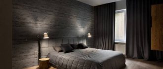
Bedroom in blue: concept and choice of interior design
It has long been believed that this particular color will best emphasize the strength of character and will of a person.
IMPORTANT! If the owners of the room have chosen this tone as the main one, it is recommended to use it in furniture, and leave the walls, ceiling and floor neutral, but with harmonious blue elements
In psychology, love for blue is an indicator of determination, self-confidence, and leadership qualities.
Today there are many styles that use blue as a primary or secondary color.
Designers recommend paying attention to marine, Provence, minimalism, modern and other similar concepts. Blue walls in the bedroom or just furniture - these parameters depend on the preferences of the property owners, the parameters of the apartment (plan)
A bedroom in this color is an ideal solution for people who highly value relaxation and home comfort.
Recommendations for finishing
If blue is chosen as the main tone for wall decoration, then it is better to give preference to wallpaper in delicate light shades or pastel colors. Painting walls with water-based paint is also suitable. If you doubt this option, use paintable wallpaper; you can change the color scheme on it at any time.
The walls are decorated with rich dark blue only in a large bedroom. In a small room, the walls should be light pastel.
Bright blue walls - a modern and creative solution
The palette on the walls implies a white or beige ceiling (painted or suspended). In a room of any size, a delicate blue ceiling (possibly a modular stretch ceiling) looks harmonious.
Most often, in a blue room, the brightest colors are the walls and ceiling.
A dark-colored ceiling is rarely appropriate and only in a large room with a high ceiling, where it will be associated with the starry sky.
A varied range of colors looks better on stretch ceilings than on painted ones.
The flooring in the interior is used in natural tones. This could be parquet, laminate, or, in extreme cases, linoleum as an economical option.
It is worth paying attention to furniture made of natural wood
If the main color of the bedroom is blue, then blue furniture and a bed with a high back will look very elegant. The surface of the furniture can be decorated with details. If desired, it is possible to install a canopy.
Blue color requires careful approach to lighting
A rich palette requires proper lighting. The color belongs to the cold color range; it is associated with morning freshness and night coolness, so soft and warm lighting is welcomed. Do not use bright fluorescent lamps; dim lighting from economy-style bulbs is sufficient. A suspended ceiling involves the use of spotlights, while a regular ceiling (painted or whitewashed) requires a chandelier. Additionally, use wall sconces, floor lamps, and table lamps.
In addition to the chandelier on the ceiling, you can also choose sconces, floor lamps and table lamps
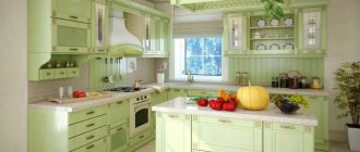
Shades of green for every style
Credit: @
The bedroom interior in green tones and the shades of the main color will be influenced by the style of room decoration you choose:
- classic style prefers depth of color;
- the east loves all shades of natural stones (malachite, emerald, jade) or a protective shade;
- romantic style is the tenderness of colors;
- country style is the brightness of the color palette;
- modern style - bedroom with a predominant gray-green tone;
- minimalism - swamp color predominates and the color of forest foliage.
Decide on shades of the main color based on the style of the interior. Then all the furniture and related accessories are selected.
Properly selected textiles are also important when decorating a relaxation room. Natural lighting plays a significant role. For a room on the south side, it is recommended to use fabric of a rich tone, dense in texture. For northerners, light fabrics in delicate tones are better suited.
Pay attention to the olive color in the interior, which will give an atmosphere of calm - read more.
The room is in a soft olive shade. The atmosphere is conducive to relaxation
Interior in green. The combination of white and delicate green is a bedroom for newlyweds
A bedroom interior in green tones is an unusual solution for decorating your vacation spot. But by choosing the right combination of colors, you will get an original and fresh solution for the interior design of the rest room.
Wallpaper for the bedroom in blue tones
For such an interior, plain, light-colored wallpaper is best suited. If you want to make your bedroom visually smaller, you can choose a darker shade, but here it is important not to make a mistake or overdo it. For lovers of interesting designs, neutral wallpapers with contrasting blue inserts are suitable. This will freshen up the room and add playfulness. Another idea for original wall decoration is a panel of wallpaper of different shades and textures. But here you need to be very careful not to make the walls tacky and flashy. Blue walls in the bedroom will also look great if you choose the right shade.
By choosing wallpaper for your bedroom in blue and striped tones, you can easily create a marine style. Wooden accents in the form of shelves or picture frames will help consolidate the effect.
Photo of striped wallpaper in a classic bedroom in blue tones: cdn.shopify
It is better to decorate the ceiling in a classic white version or a neutral light gray tone. If you choose a suspended ceiling, you can achieve a mirror effect and even greater visual expansion of the room. Otherwise, it all depends on the size of the room and preferences.
A dark floor finish will look harmonious. Ideally, carpet or laminate is a couple of shades darker than the walls. If you decorate everything in one shade, you risk making the room cold and uncomfortable. At the same time, a light floor with dark furniture will look great, so it all depends on the final result.
Photo of bedroom interior design in blue: s3-ap-southeast
What rooms are they used for?
Designers use shades of blue to decorate different rooms in the apartment.
Kitchen
The facade of the kitchen set in an unusual blue color will become a bright decoration of any kitchen.
To ensure that rich blue shades do not visually make the room smaller, it is important to harmoniously dilute them with light gray or beige tones
Beautiful dark wood furniture will add additional charm to a blue kitchen.
An effective solution would be to use technology in this color.
Living room
The deep blue color in the interior of the living room will have a positive effect on the psyche of people who spend time in it.
Such rooms will become your favorite in the apartment. A spectacular combination of blue with beige and white is used to decorate living rooms in both classic and modern styles.
Luxurious blue will help emphasize the subtle, refined taste of the owners of the room.
Wooden interior items will look impressive in a blue living room.
Bedroom
Warm blue shades promote good rest and healthy sleep.
If blue tones are chosen for decorating the walls in the bedroom, then it is important to remember that the color should not be too saturated
High-quality white furniture looks harmonious against the background of blue walls.
Delicate shades of blue will go well with a dark wood bed.
Beautiful picture frames matched to the same tone will become a spectacular decoration of the bedroom walls.
Bathroom
When decorating a small bathroom, a rich blue tone should be used sparingly. One of the walls of the room can be lined with tiles of this color.
An unusual blue pattern on light tiles will help visually enlarge the room.
If you need to decorate a spacious bathroom, then blue can be taken as the main tone.
Beautiful blue shades will fit well into the interior of a room that will be regularly used for rest and relaxation.
What flowers should you be afraid of?
In addition to the fact that we purchased blue curtains for the bedroom, blue curtains and robes of the same color, the room needs to be filled with a lot of other necessary things. Bedside tables, bedside tables, floor lamps, lamps, bookshelves and photo frames are also needed here. And the bed itself can be blue!
Accents in the interior - a blue bed and a rug with a blue pattern
Note. It is not necessary to select all these decorative elements in one color scheme, and it is also tedious. However, it will not be useful to collect all the colors of the rainbow at the head of the bed.
Which colors will play perfectly in unison, and which will have to be removed:
- As mentioned earlier, light brown, beige, and chocolate tones will look nice with blue shades.
- It would be very appropriate to use fresh green elements in the decor: soft bedspreads, small pillows, soft bedside rugs. Blue wallpaper for the bedroom will be perfectly emphasized by white and light green thin photo frames on the walls - they will refresh the room.
- It is also advisable to paint the door frame for such a bedroom in walnut color.
But there are some flowers you should be afraid of. They can not only spoil the picture of the interior, but also negatively affect your well-being.
| Red | The combination of red and blue colors in everyday life is very useful - it helps to concentrate on any mental work and increases the energy charge. However, in the bedroom, of course, this surge of energy will be of no use to us - it will interfere with sleep and relaxation. Let this color take its place in the kitchen - that’s where your fantasies belong. |
| Black | It also has a negative effect in combination with the color blue. Besides, it will simply look ugly and too mournful. A bedroom in blue does not include the use of this color at all; it is not recommended to abuse it in the apartment in general. |
| Violet | Against the background of the blue tenderness we have spilled, the purple splashes will look like blots and paint spilled on a blank sheet of paper. In addition, they excite the mind to give birth to unthinkable ideas. In combination with other colors, purple and its shades will look good in the living room. |
| Orange | A very warm and friendly color, it is not suitable for an adult bedroom. This color will not allow you to relax properly; bright shades will excite the brain before bed, and after waking up they will be too harsh. |
We present examples of the most successful combinations in the photo gallery:
Distinctive Design Features
The effect of blue color and its shades has a beneficial effect on human psychology. In a room where blue tones are used, you feel:
- friendly atmosphere;
- how easily the information received during the day is assimilated;
- relieving tension and fatigue;
- that the heart works normally without rhythm disturbances;
- decrease in blood pressure.
Shades of blue create harmony in the interior and within a person. A correctly selected palette and combination of shades is of great importance for complete relaxation and relaxation in the bedroom. Don't be afraid of a cold tone in the design of a relaxation room. When choosing furniture, textiles, and room decor, you should combine bold colors, emphasizing the individuality and unusualness of the house.